Article
3 comments

What is inside your SharePoint CSS

What is inside the SharePoint CSS

Ever wondered what is defined in the corev15.css? Let’s take a little look to some statistics of this style sheet. Another thing I like to consider how you change the style sheets when additional frameworks such as bootstrap will be applied to SharePoint. Plus, we will take a look how SharePoint Style Sheets will be changed when an branding will be added based on Bootstrap.

[Read more]

Article
2 comments

Enhance suite bar for your responsive experience

Over the last year I did more branding projects on Office 365 than on on-premise. Since the first call by Microsoft to avoid modifications of the master page I played around with certain scenarios and patterns to reduce or avoid such modifications.
One common issue is that the suite bar is responsive (everything that resize is responsive) but not well optimized for mobile. Without any enhancements this part of SharePoint shows only half of the content. With some small CSS only modifications the suite bar looks great on nearly any device.
The following blog post use SASS pre-processed CSS the compiled CSS can be found too at the end of this post.

[Read more]

Article
3 comments

Things you should know about web fonts and font packages

During the last years I’ve intensively used web fonts. Since I published the first blog post on how you use web fonts in SharePoint 2010.
While I just downloaded the web fonts and used the CSS that was included in the font packages I recognized more and more that most of the available web fonts are wrong defined inside the font packages. There are a couple of problems with the definitions of the @fontface that you can avoid creating a cleaner style sheet.

Roboto font

Roboto font

[Read more]

Article
1 comment

Optimise HTML Output of the Rich Text Editor – “-ms-Element” explained

One big prejudice is that SharePoint is not capable to produce clean HTML output via the rich text editor. This was somewhat true with the previous versions of SharePoint. In SharePoint 2013 this has improved and can output all basic text elements without any additional style sheet classes.

How is this possible? By using the magic “-ms-element” attribute.

Element behaviour in the past

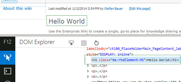
To explain how this works in the current version we need to take a look back to the rich text editor definitions of SharePoint 2010. To show I picked out the style definition for the “Header 1” element. This will be rendered as <h1 class=“ms-rteElement-H1”> .

The definition in the “corev4.css” goes like this:

H1.ms-rteElement-H1
{
    -ms-name:"Heading 1";
}
.ms-rteElement-H1
{
    font-size:2em;
    font-weight:normal;
}

The first definition is not a visible style. It is more an indication for the rich text editor that there exists a style definition for an H1 element. The label for the drop down is defined by the “-ms-name” attribute, a Microsoft specific vendor prefix. The H1 prior the classname defines the element that should be rendered.

The second style definition contains then the style that should be applied to the H1 element.

SharePoint 2010 - Rich text editor format and source code

SharePoint 2010 – Rich text editor format and source code

This worked perfect, but every single paragraph, list and headline had those classes assigned. Due this classes the file size increases.

Something to worry about? Let’s take a look how the browser handle those styles and tags.

Rendering in the browser

The most important style sheet files is the “corev4.css” in SharePoint 2010 and the “core15.css” in SharePoint 2013. Both files are huge and have a lot of design information. How will those files rendered by the browser internally?

The browsers follow a clear logic how they render all the elements and style definitions.

  1. Parse all tag styles (eg. H1, H2, P,…)
  2. Parse all class style definitions (eg. .ms-rteElement-H1)
  3. Parse all ID style definitions

“This hierarchy is the reason why sometimes ‘!important’ needs to be used because a style definition of a class gets overruled by an ID definition.”

This parsing goes all through the DOM and requires some time. Once the style is known by the browser the rendering commands will be sent to the render engine and the content gets displayed. To optimise the overall output performance, we just want to have clear HTML element with easy to identify the styles of those.

This is not so important for desktop browsers, but think about mobile devices and the bandwidth you have there. The structure of the HTML and the CSS have direct impact on the user experience, especially on older devices.

Optimise the HTML output using -ms-element

In the style sheets of SharePoint 2013 in some places a mystical new vendor prefixed attribute have been introduced. Mystical because there is a big lack of official information on this.

I research this behaviour. From my experience this attribute is responsible to render only the HTML tags instead of output it the old fashioned way like it was in SharePoint 2010. To explain how this works, let’s use the definition of the “Header 1” once again. First, we take a look at the code that can be found on various places in the “core15.css”.

/* Style 1: General definition of H1 */
h1, .ms-h1
{
	/* [ReplaceFont(themeFont:"large-heading")] */ 
	font-family:"Segoe UI Light","Segoe UI","Segoe",Tahoma,Helvetica,Arial,sans-serif;
	font-size:2.3em;
	/* [ReplaceColor(themeColor:"SubtleBodyText")] */ 
	color:#777;
	font-weight:200;
}
/* Style 2: HTML Definition to add the style to the drop down */
H1.ms-rteElement-H1
{
	-ms-name:"Heading 1";
	-ms-element:"true";
}
/* Style 3: Output optimisation */
.ms-rtestate-field h1,
h1.ms-rteElement-H1,
{
	line-height:1.4;
	/* [ReplaceColor(themeColor:"ContentAccent1")] */ 
	color:#0072C6;
}

The first part of the style shows the general definitions of all H1 tags wherever this will be used in the source code (Style 1).

The second definition (Style 2) defines as before that the editor should list “Heading 1” style in the rich text editor drop down and then there is the “-ms-element” attribute. So this means when a user browses the content only the H1 tag is included in source code. All without any additional class on the header.

The most important part is the third because it shows two different definitions. The “.ms-rtestate-field H1” definition is used for the view mode only. “.ms-rtestate-field” is the style sheet class that encapsulates the rich text editor content while H1 identifies the child tag.

The definition for “h1.ms-rteElement-h1” is the same definition as we had in SharePoint 2010 but now it will be only used for the edit mode. You will see this if you take a look at the source code during editing.

SharePoint 2013 - Rich Text Editor format and Source Code

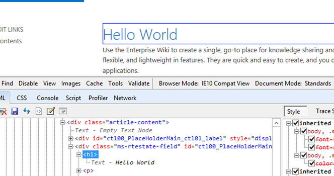
SharePoint 2013 – Rich Text Editor format and Source Code

Now the content will be rendered differently in display and edit mode. Therefor both definitions are required to display the content correctly.

Summary

As you see now the rich text editor is able to output clean HTML code for all typographic standard elements. Every modern web content management use this. So does SharePoint. The benefit of this is that content migration from other systems is now easier because all that is needed is only plain HTML. Another benefit of this is that it has a positive effect on the SEO ranking of a public facing web site.

Customisation can be done if easily now because all that needs to be define are styles for the standard text element.

Article
17 comments

Fixed width design in SharePoint 2013 – The fast way

I already provided a way to define a fixed width master page for SharePoint 2010. You might think that fixed width is not required because of all the fancy responsive web design. Mastering a fixed width design in SharePoint allow you to master responsive web design too. This is commonly known as progressive enhancements. By creating a fixed width master page first it can be easily adopted to responsive design too.

The modification are based on the seattle.html and if you haven’t done much with SharePoint Designer or master pages in 2013 I recommend you to read Master pages, the Master Page Gallery, and page layouts in SharePoint 2013 first. First I made a copy of the seattle.html because I wanted to provide the default look but add a fixed width. I also wanted to support the focus on content functionality that exists in SharePoint 2013.

Modifications in the Master Page

In SharePoint 2010 a JavaScript add the width of the current browser window to the s4-workpace element. This behavior hasn’t changed in SharePoint 2013. The good news is that applying the „s4-nosetwidth“ to the “s4-workspace” div avoids the JavaScript handler from being fired.

Before:

<div id="s4-workspace" class="ms-core-overlay">

After:

<div id="s4-workspace" class="ms-core-overlay s4-nosetwidth">

Depending on the template that will be used in another issue arises. In my case there was a problem with the float containers of an Enterprise Wiki Template. The problem with those containers is that if they haven’t been implemented properly the surrounding div will collapse and reduce its size. In worst case to height will collapse to 0px. This can be avoided by using the so-called “clearfix”. I recommend you to read all about float on CSS Tricks to get more details about this behavior.

Fixed width master page without clear fix

Fixed width master page without clear fix

So to get the fix applied I decided to use the div-clearfix method. It doesn’t hurt much and also has not much impact on the over html source. The position where I placed my div can be found at the vary end of the “s4-contentrow” right before the closing div.

                </div>
            </div>
        <div class="clearfix"></div>
    </div>
</div>
<!--SPM:<SharePoint:ScriptBlock runat="server">-->


Master page is done. Now we are ready to do some CSS magic. Don’t close the master page yet. We still got something to do.

Adding Style Sheet

First we need to add a style sheet to SharePoint. The most pleasant way to do this is by adding the server control named CssRegistration. First look for the CacheManifestLink element and place the CssRegistration below.

<!--SPM:<SharePoint:CacheManifestLink runat="server"/>-->
<!--SPM:<SharePoint:CssRegistration name="&lt;% $SPUrl:~sitecollection/Style Library/fixedwidth.css %&gt;" runat="server" after="SharepointCssFile" />-->


In my case the CSS File is called “fixedwidth.css” and is stored in the Style Library.

/*** Default setup ***/
#s4-workspace{
    /* background-color of the workspace */
    background-color: silver;
}

#s4-bodyContainer{
    /* defines 960px by using 60rem = 60 * 16px (Default Font Size) */
    width: 60rem;
    margin:auto;

    /* background color of the content */
     background-color: white;
}

/*** Fix for the dialogs ***/
.ms-dialog #s4-workspace{
    background-color: white;
}

.ms-dialog #s4-bodyContainer{
    margin: 0px;
    width: auto;
}

.ms-dlgContent #s4-bodyContainer{
    width: auto;
}

/*** clear fix ***/
.clearfix{
    clear: both;
}

I hope that the comments in the style sheets are descriptive enough for you. Otherwise please post a comment with your questions. In the end the result should look like this.

Final fixed width master page

Final fixed width master page

You will also find he download link at he end of this article.

Finally let’s take a closer look at the em, rem and pixel values.

em, rem instead of px

Using pixel in style sheets is something from the past. You still can use it but to be more flexible it’s recommended to use relative units like em, rem or percent.

Assume you have set the font size of a div element in your design to be 12px and like to have a total width of 60px for this element. Then you can simply assign a width of 5em.

12px * 5em = 60px

If you increase the font size of that element the width will scale in proportion. Setting the font size to 14px then the width of the element will be 70px.

14px * 5em = 70px

The downside of this is that you need to know every font size of every element to assign the proper value. The good news is there is the rem unit.

Instead of referring to the current element the rem, also called root em, refers to the font size of the body, which is a static value. The default value of the body is 16px. Now if you like to get a total width of 60px all you need to do is to divide the width with the font size.

60px / 16px = 3.75rem

That is the whole concept explained in short.

Worried about the browser that understands root em? Internet Explorer 8 doesn’t understand this value but you can define a simple fallback for that. This looks for the s4-bodycontainer like this:

#s4-bodyContainer{
    /*** only for IE8 and below ***/
    width: 960px;

   /**** for the future ***/
    width: 60rem;
    margin:auto;
     /* background color of the content */
     background-color: white;
}

To get a detailed overview of browser that support rem you can browse caniuse.com.

Download fixed width master page FixedWidthMasterPage.zip