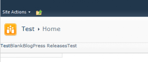
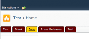
The navigation in SharePoint 2010 has slightly changed and will now be rendered a new way as a list. To use list elements instead of tables is a common practice in web development. The structure of the navigation and therefore the top navigation has some important elements and style sheet classes that allow you to theme the top navigation really easy.
The Basic
The top navigation is a list as mentioned before. Inside a list element is a hyperlink that contains a span element. The source for one element on the top navigation looks like this:
<li class="static">
    <a class="static menu-item" href="/Blank">
        <span class="additional-background">
            <span class="menu-item-text">Blank</span>
        </span>
    </a>
</li>
To get a rounded navigation the background will be attached in this example to the hyperlink and the additional-background class. To reset the navigation add the follow style to your stylesheet.
.s4-tn ul li.static,
.s4-tn ul li.static.selected,
.s4-tn ul li.static a.static,
.s4-tn ul li.static a.static.selected{
    padding: 0px;
    margin: 0px;
    background-color: transparent;
    border: 0px;
    background-image: none;
}
This style removes all paddings, margins and anything else that is not needed.
The Background Image
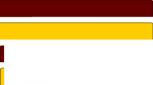
For the background images is use CSS sprite. If you don’t know what this is you can find a really good article on “A list apart”. Basically I us only a single background image and move the background around using background-position property. So the background image is use looks like this:
The red area I will use as a navigation background. The yellow will be my hover effects and also mark the selected navigation element but I will tell you later more.
The navigation
In the previous step I removed all margins and padding, which is good because now all navigation elements have now all the same values and set to zero. To attach the background I first stretch the navigation elements back to the values I will use later for the navigation.
.s4-tn ul li.static a.static,
.s4-tn ul li.static a.static.selected{
    background-color: orange;
    padding-left: 10px;
    padding-bottom: 9px;
    margin-right: 5px;
    color: white;
}
.s4-tn ul li.static a.static .additional-background{
    background-color: maroon;
    padding-right: 10px;
    padding-top: 5px;
    padding-bottom: 6px;
    color: white;
}
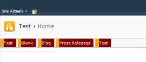
These styles above will let the top navigation look like this:
The final Step
Now to get the background image on our navigation you just need to add the background-image property to our style sheet. To get the parts of sprite in the right position we need to add the background-position too. The style sheet look then like this:
.s4-tn ul li.static a.static,
.s4-tn ul li.static a.static.selected{
    background-image: url('/_layouts/navigationtest/navigation-bg.png');
    background-repeat: no-repeat;
    background-position: left -120px;
    padding-left: 10px;
    padding-bottom: 9px;
    margin-right: 5px;
    color: white;
}
.s4-tn ul li.static a.static .additional-background{
    background-image: url('/_layouts/navigationtest/navigation-bg.png');
    background-repeat: no-repeat;
    background-position: right 0px;
    padding-right: 10px;
    padding-top: 5px;
    padding-bottom: 6px;
    color: white;
}
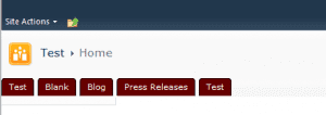
And now you have navigation with round corners then looks like this:
So this wasn’t rocket science so far and only a view line of style sheet mission can be accomplished. One thing left missing, so what about the hover? Even no problem but we need to move the background images. The style for that looks like this and hover is done.
.s4-tn ul li.static a.static:hover,
.s4-tn ul li.static.selected a.static.selected,
.s4-tn ul li.static.selected a.static.selected:hover{
    background-position: left -180px;
    color: black;
}
.s4-tn ul li.static a.static .additional-background:hover,
.s4-tn ul li.static.selected a.static.selected .additional-background{
    background-position: right -60px;
    color: black;
}
And so it should look then:
The style above also alters the style of the selected tab and the whole style adaption has only thirty two lines of pure css without any jquery or other code required.
Conclusion:
So in general Microsoft done a great job to get rid of the lame table based design to a completely more web designstandard way. Styling the navigation is one good example how easy some things have become in SharePoint 2010. The classes on the element are better structured and well attached to the elements. Simple hover effects even don’t need any scripting code at all.
