Article
3 comments

Image Renditions available in Modern Team Sites

Yes, you read correctly. The modern team sites got image renditions or at least predefined image formats that will be used by the responsive experience of modern team sites.
Back in the past image renditions was exclusively available in publishing sites only. Well, you were able to use them in team sites too, but the publishing features had to be enabled at site collection level. In addition, classic image renditions might cause negative performance impacts. This was first spotted and documented by Chris O´Brien.
I guess this new feature doesn’t have much to do with the traditional image rendition and you are able to use it in your web part code too. For example, if you like to write a custom image gallery or develop a classic display template.
[Read more]

Article
1 comment

Why not use Office UI Fabric? – Part 1

This question Waldek and I had to answer a couple times after the Mobile Quick Contact PnP sample has been released. There are several good reasons to use Office UI Fabric but there are also some scenarios currently not well covered. While the last blog post was more on how we built it, this tells more the story why we haven’t chosen Office UI Fabric.
Right after I started to write this blog post I noticed the overall considerations might be broader then cover it in a single blog post. I decided to split this single blog post into the following three chapters.

First, let’s take a look at the reasons why we haven’t used it in our sample.

[Read more]

Article
0 comment

Make SharePoint SASSy – Webinar recording now online

Today I had the great pleasure to record a webinar for SharePoint Europe. Actually, it was not a new session, it more hat the purpose to show people how I develop now in SharePoint. Especially how my branding workflow nowadays looks like. I use now SASS for all my branding in SharePoint, because it has a lot of benefits in manner of consistency, reusability and fundability of CSS changes and adoption.[Read more]

Article
2 comments

How to handle table component of Office UI Fabric

In fact the source code of the table component of Office UI Fabric looks a bit weird because it is currently built with <div> elements instead of HTML table elements.
The intention behind such div based tables come from the idea to improve the responsive behavior. This idea behind this is almost more than five years old. A time that marked the beginning of responsive web design. Nowadays this pattern is only hardly used because no matter how you build your tables you always face the same problems.
Yesterday i got the confirmation on GitHub that this pattern is subject to be changed.
Time for me to show how this pattern can be transformed to a normal HTML element and to show some advanced techniques to deal with tables in responsive web designs.

See the Pen Office UI Fabric – Table by Stefan Bauer (@StfBauer) on CodePen.14928

[Read more]

Article
7 comments

Responsive List Forms – Don’t panic it’s just a table

When it comes to responsive web design and tables some people might get a panic. In general there is nothing bad about tables. Just treat them right.

This time I like to show how to make list forms responsive. Actually, this sound harder than it really is just because the form is rendered in a table. A table is as good and flexible as any other HTML element and can be transformed into any other form.

DON'T PANIC


[Read more]

Article
0 comment

The not so responsive new Office 365 suite bar

Many people recently discovered a new enhancement in Office 365 and especially SharePoint. The suite bar is now responsive if “First Release” option on your tenant is activated.

Responsive Office 365 suite bar rendered on mobile device

Responsive Office 365 suite bar rendered on mobile device

The first people that blogged about this responsive improvement were Wesley Hackett and Marc D. Anderson.
The current implementation works well on desktop but not on mobile devices.

Why it doesn’t make your Office 365 / SharePoint responsive?

Actually the current suite bar lacks of one important thing. The viewport meta tag is currently not implemented in SharePoint or Delve. This tag is responsible to render the page correctly. The display of modern devices has a higher pixel density than the normal desktop computer. The viewport meta tag helps the browser to scale web sites properly. Is this html tag missing in the header of the html document the website will be rendered as a desktop version, but everything is tiny and unreadable unless you pinch and zoom.
If you have a new Lumia 950 for example the pixel density is 314 pixels per inch. Desktop monitor in reality has pixel densities beyond 72 pixels per inch but thus the actual base size your browser renders the web site. All CSS values are calculated based on this.

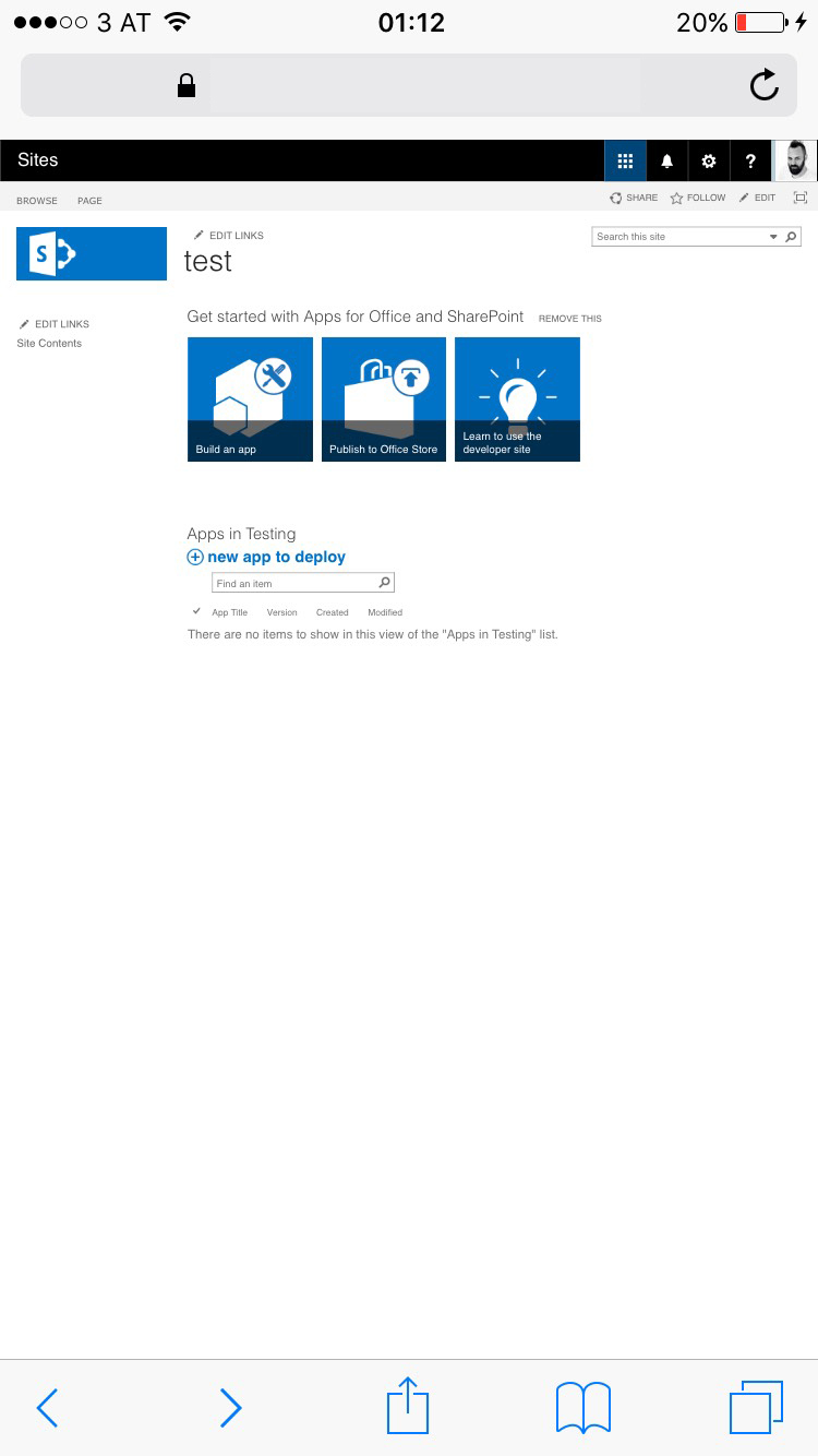
On mobile devices without a proper viewport meta tag the web site will look like the desktop version, but really tiny and therefore unusable.
This brings us back to the new shiny responsive suite bar. A good example when a web site wasn’t tested on a real device. Works perfectly on a desktop browser but not on mobile. Someone might have forgotten to include the view port on the master page. On my phone, SharePoint will be rendered like this.

Suite bar rendered on mobile device

Suite bar rendered on mobile device

As mentioned earlier, it is currently only available for first release subscriptions. So currently nothing to worry about. I hope this will be fixed in the final release and we currently see an early beta version of the suite bar.
Where can the problem be spotted. Simply everywhere in Office 365. Here is a detailed list:

  • Missing viewport meta tag
    • SharePoint
    • Delve
  • With viewport but not responsive design
    • Outlook
    • Calendar

Outlook and Calendar use device detection. Some sort of Device channel to work responsive.
The only first an real native responsive apps are currently Sway and blog post on Delve. Both are equipped with a correct viewport.

Final thoughts

The new suite bar gives a nice outlook on coming up design features. I expect to see more improvement in the near future. Currently, SharePoint in Office 365 and SharePoint 2016 is built upon XHTML 1.0 and not HTML 5. Once the doctype have been converted an all functions work on HTML5 I guess we will see more adoptions to come out faster and more reliable.

From my perspective the new suite bar is a fast shot. I also have concerns about the usability. On mobile the waffle aka app launcher is hidden behind the three dots in the suite bar. To switch between SharePoint and Mail or Calendar users have to tap twice. This forces to learn user a new behavior because the app launcher was one of the essential improvements recently.
On the tablet devices the app launcher is jumping from left to right. This is actually a no-go. User will get confused. A small resize of the window is enough to show this effect. You don’t even have to be on a tablet device.

If you think about to change the master page of SharePoint to make this work. In Office 365 editing the master page is not recommended to do so. I guess this issue will be fixed by Microsoft sooner or later.
In case of a publishing page SEO meta tag injection can be use to add a proper meta tag. For a javascript based solution to add the viewport meta check out the solution provided on OfficeDev Pattern & Practices.

If you have other concerns, feel free to comment on this blog post.

Article
0 comment

Responsive vs. Adaptive Web Design – What about Device Channels?

Three years after responsive web design was introduced by the “A list apart” – article – “Responsive Web Design” by Ethan Macotte. The reason why people love this is because it can be easily implemented. You just need to have a browser that supports CSS3 and HTML and you are ready to go. Is it really like this?

Currently web design is in a state that we code against the gray. We don’t know the devices that might access our web site.  A resolution of a screen doesn’t give any information about the device.

This is the main problem from my point of view. We care too much about device resolution but neither the user nor the context the device is being used. Using a tablet – the user might want to have the same user experience as reading a book or magazine. Using a phone – the user might in a hurry and just want to get a brief introduction to read on a tablet or desktop later on.

In the following presentation I try to sum up Responsive and Adaptive Web Design and what SharePoint 2013 has to offer to connect the users, their context and the content.

The truth is that the consumer of your content doesn’t care if something is done on the server or on their client as long as they feel comfortable with the content and their context.

I held this presentation during ShareCamp Vienna (7.9.2013). Special thanks to organize this event: Thorsten Hans, Christian Glessner, Martina Grom, Toni Pohl, Hans Bender and everyone else who was involved in the organization of this event.

Finally I want to thank Brad Frost for the ongoing inspiration and lending me some slides.

Additional feedback on this presentation can be found on SPYam.
Feedback is always welcome.