Colour palettes are a mystery in and of itself. Fluent Design, Material Design, Tailwind or even Bootstrap have them, and the colours have colour labels. I always wondered where these numbers are coming from until I recently had enlightenment.
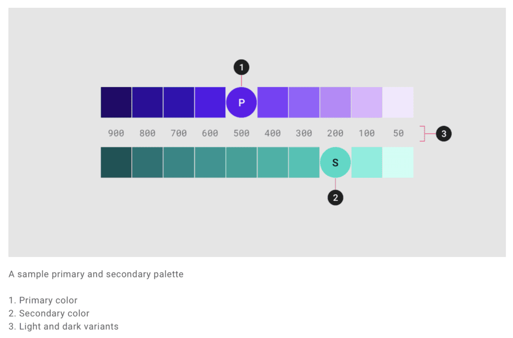
All palettes follow the same order from lighter to darker colours, with the regular colour somewhere in the middle range. Here are some examples of the most popular Frameworks.
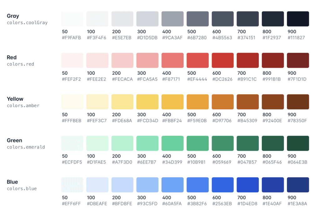
Material Colour System
Bootstrap Colour System
Tailswind Colour System
Origins of the values of the numbers
As far as I know, the first design system that introduces the numbers attached to the colours was Material Design. For a long time, I wondered where these values come from until it clicked yesterday.
The lightest colour uses a 50 or 100, the darkest colour range somewhere in the 900. It bugged me for a long time where is the origin of those numbers. It might have anything to do with opacity, transparency, hue, lightness, saturation, or any other value defining the colour.
The answer to these numbers is pretty simple, but I could not make a connection with it. In CSS, the font-weight share the same mysterious numbers.
| Value | Common Font Weight Names |
|---|---|
| 100 | Thin |
| 200 | Extra-Light |
| 300 | Light |
| 400 | Normal (Regular) |
| 500 | Medium |
| 600 | Semi-bold |
| 700 | Bold |
| 800 | Extra-bold (Ultra-bold) |
| 900 | Black (Heavy) |
So the thinner the font, the lower the number is. The bolder the font is, the higher the number is. These values come actually from the Open Type Specification.
The numeric value in the case of fonts has a different purpose too. So when the font-weight has a value normal (400), a lighter font would then use 300; a bolder font would be 500.
This method works in font-weights pretty well, especially with variable fonts; those values become more important than ever. When the parent container has set a font-weight with a value of 500 specified, and you like to make, let’s say, a title bolder. The easiest way is to specify font-weight: bolder and get the next bolder available font-weight.
Sidenote: font-weight: bold will just end up with a font weight of 700, while ‘bolder’ might return 600 instead.
The same number system got introduces to colour palettes too. If I am not mistaken, Material Design was the first one to describe a colour palette in this way.
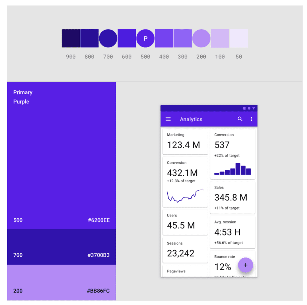
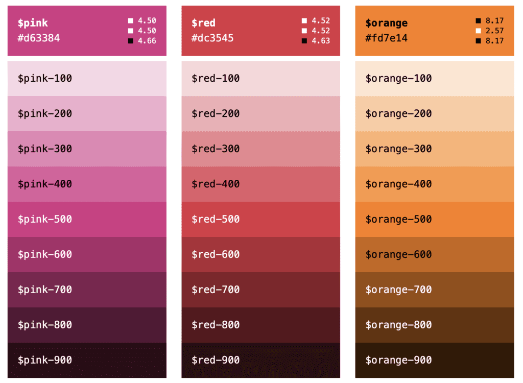
Different Colors from Material Design applied
The lightest colour equals 100 or 50, the boldest or darkest colour equals 900, and all other variants in between. It seems like it has become an unofficial industry standard for palettes on the web and in-app development. It makes the colour system also easy to remember when you are familiar with the font weights system. Or think about it like this the higher the number, the darker the font becomes.
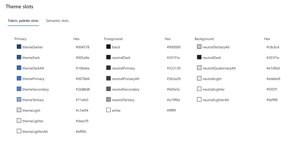
Fluent Design
Fluent Design “innovates” this model to have names instead of numeric values.
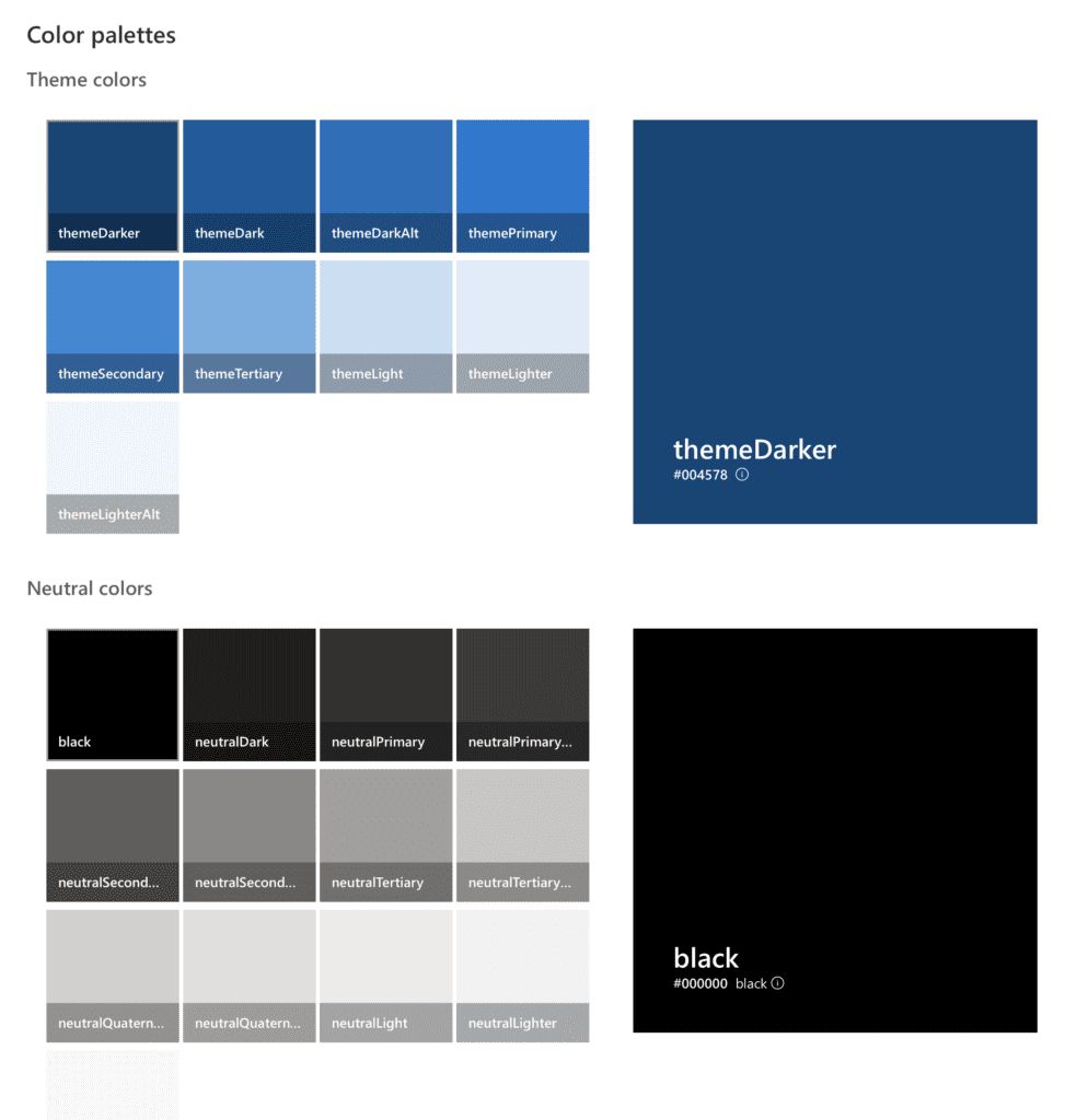
Theme colours defined in Fluent Design
It is hard to remember those. You look in your design for a lighter colour; you always have to look it up. There is no easy way to get your head around it. Following the same numerical solution would have been too easy. Especially they are not consistently named in the primary theme palette.
The default grey scale follows a different pattern.
There was a time when Microsoft was leading the design into a new area. I am talking about the Metro area, but recently, Microsoft is sadly not innovative in Fluent Design and draws more people away from using it.
To be honest, I find this simple number version pretty solid. I look forward to harmonising it with other frameworks in my hTWOo Fluent Design framework in future.
Also published on Medium.