
This article is one of the follow-up articles on how to use the HTML Dialog element in SharePoint Framework. Now we look closer at the possibilities of positioning the modal dialogue.
You will learn to put the dialogue on the page’s top, bottom, left, and right.
Adding CSS to the dialogue
The modal dialogue was only centred on the screen in the last blog post. This default behaviour is good, but it can get influenced via CSS.
Theoretically, I could put all my CSS into the modules.scss file of the web part, but I like to have some separation and move the effective CSS closer to the components.
Having multiple files with the extension ‘modules.scss’ is a wrong approach.
Dealing with more files named ‘modules.scss’ in just one module or webpart component can be tricky regarding responsive design. The method is not something I would recommend. Instead, a file named ‘_placeholder.scss’ is a so-called SCSS partial and does not end up in a dedicated CSS file.
To add this dedicated CSS file to our web parts code, we need to change the default SCSS.
.dialogTest {
  display: flex;
}
By importing the ‘sass:meta’ module, we can add the placeholder to our webpart.
// Load sass meta module
@use 'sass:meta';

.dialogTest {
  display: flex;
}
// add styles from placeholder
@include meta.load-css('./components/placeholder');
The file extension on the ‘@include’ is not required, nor the underscore, because the SharePoint Framework will resolve the path just fine.
Make styles in the component
Instead of creating a dedicated ‘module.scss’ file for my component, I just use, or better reuse, one of the web parts. We use strong-named global classes mostly to avoid code duplication. I like to show the Microsoft way here.
import styles from '../DialogTestWebPart.module.scss';
Importing the parent key-value pairs for class names is enough in the web part with styling.
That’s all for the setup. Let’s start building some styles.
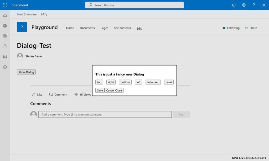
The default
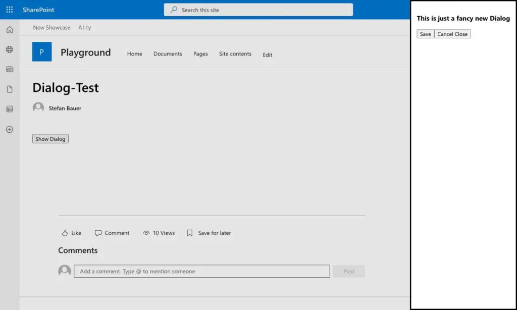
As mentioned before, the modal dialogue gets centred on the screen using the margin attribute by default.
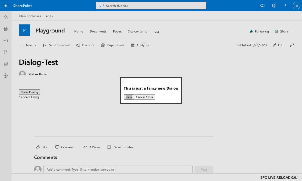
Showing a screen shot how a dialog gets centered on the screen
We can use these margin attributes to move the dialogue around.
Align left and right – aka a sidebar
Now that we know that the dialogue gets centred on the margin attribute, we can move the dialogue around pretty easily.
Let’s move it to the left side first, which can get defined by the following CSS definition.
.showLeft{
    margin-right: auto;
    margin-left: 0;
}
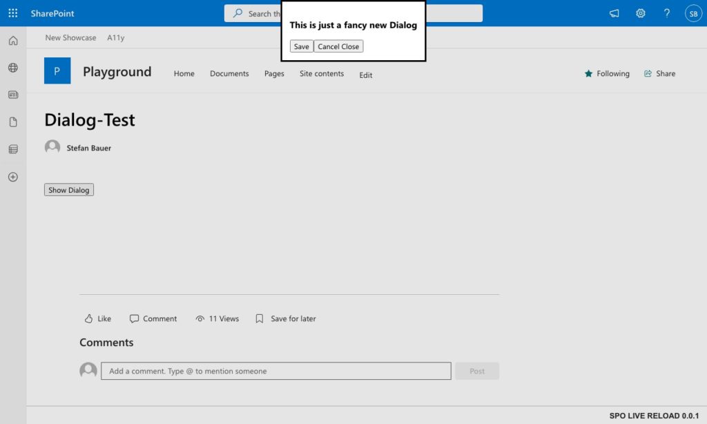
Via setting the right margin to auto and the left margin to 0, the dialog now appears on the left side of the screen.
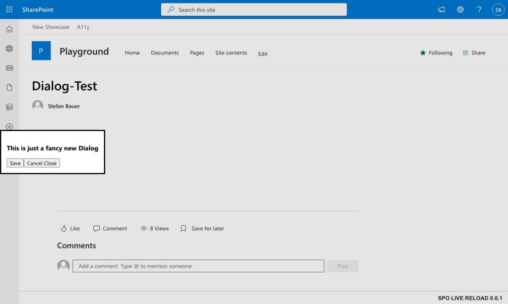
Now the dialog is left aligned on the page in SharePoint
The browser automatically handles the content width and height, so we don’t have to worry about that. While we might want to have the sidebar as high as the screen is, we can add another definition to our styles.
.showLeft{
    margin-right: auto;
    margin-left: 0;
    height: 100vh;
}
Setting the height to 100vh (viewport height) gives us exactly that full-filled screen.
If you are not familiar with the CSS using viewport height or vh, I would recommend checking out the all ‘24 CSS Viewport Units Explained‘ or get deeper insights on the viewport concept in MDN.
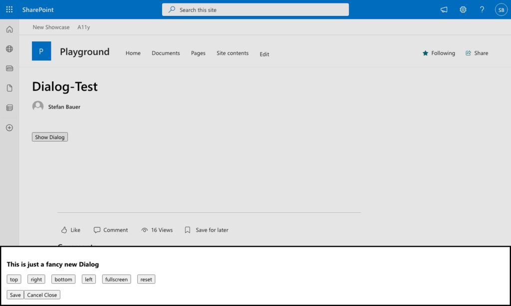
Now the only thing left to do is to assign this utility CSS class directly to the dialogue and let the magic happen.
// The dialog content
this._dialog = document.createElement("dialog");
this._dialog.innerHTML = "<h1>This is just a fancy new Dialog</h1>";
this._dialog.classList.add(styles.showLeft);
The result is a custom-tailored sidebar.
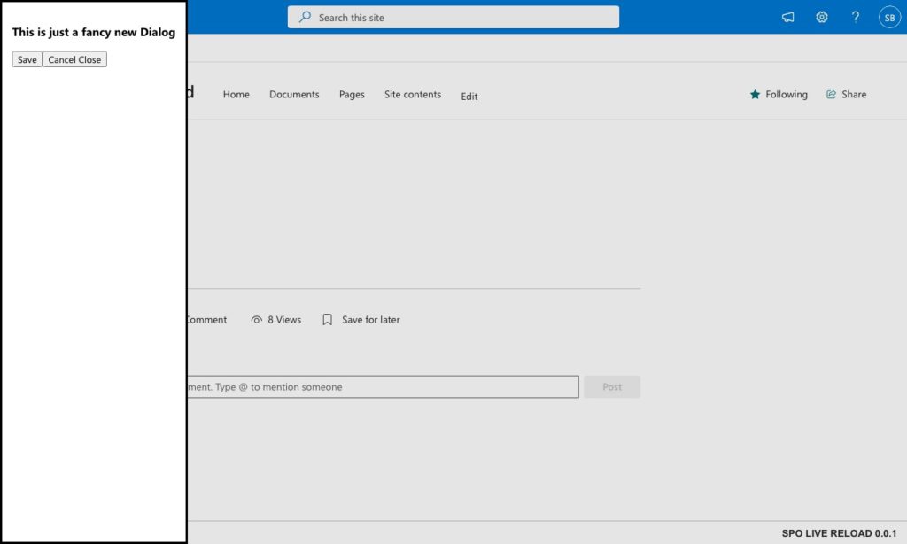
The modal dialog can even get used as a sidebar if needed.
Moving the sidebar to the right side should not be that tricky anymore, and the helper class to that only swaps the values for left and right.
.showRight{
    margin-left: 0;
    margin-left: auto;
    height: 100vh;
}
We must also assign a different helper class to do our dialogue element.
// The dialog content
this._dialog = document.createElement("dialog");
this._dialog.innerHTML = "<h1>This is just a fancy new Dialog</h1>";
this._dialog.classList.add(styles.showRight);
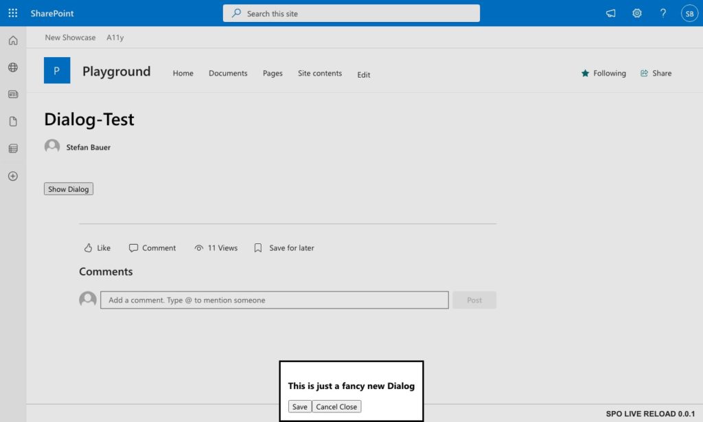
Again the sidebar modal dialogue shows up on the right side of the screen.
The sidebar can even get placed on the right site all built with a default
That is the full magic of how you add your custom sidebar.
Align top and bottom
Similar to what we did before, the same works for top and bottom-aligned modal dialogues. Let’s take a look at the top first. The CSS for that looks like this.
.showTop{
    margin-top: 0;
    margin-bottom: auto;
}
Which result in a dialogue glued to the top.
The dialog can even get placed at the top of the page.
It is simple for the bottom option to switch the top margin and bottom margin values around.
.showBottom{
    margin-top: auto;
    margin-bottom: 0;
}
Now we have the dialogue glued to the bottom of the page.
This bottom alignment might could get used for cookie banner for example – Not only inside SharePoint but everywhere.
Using the width attribute and a value of 100vw (aka viewport width), we can make a top and bottom bar covering the full width.
.showTop{
    margin-top: 0;
    margin-bottom: auto;
    width: 100vw;
}
And the result for top aligned,
Full width dialog on top of the page – suitable for any notification
as well as bottom aligned.
A full width bottom aligned dialog can be also used for notification to the user.
All in all pretty flexible to adjust for various situations with as few CSS definitions as possible.
BONUS: Going Fullscreen
To let the dialogue cover SharePoint completely, we cannot set all margin values to 0; instead, we need to set the height and width of the dialogue.
.makeFullScreen{
    width: 100vw;
    height: 100vh;
}
This way, none of SharePoint will be left over.
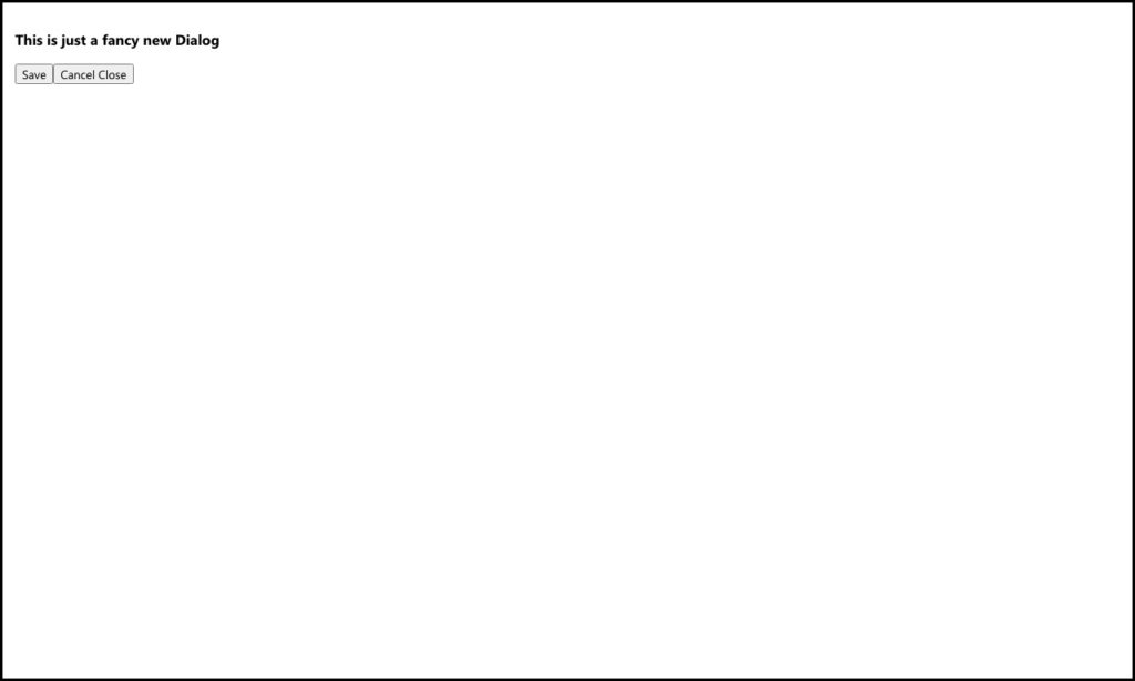
I might looks strange but there is actually SharePoint underneath, just covered by a dialog.
If you don’t trust me, here is the same result with only 80% of the viewport height (80vh) and width (80vw).
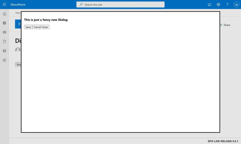
Now we give SharePoint some breathing room to shine through
Now we see SharePoint shine through.
What do you think and what’s next
Now that we covered the positioning on the page, there is one bonus by looking at the code you can find on Github. I added the code you saw here as a copy of the first introduction of modal dialogues. I showed in this blog post scenarious that placed the dialogs at nearly every end of the screen, but using the <diaglog> HTML attribute also allows you to place it everywhere else on the screen.
Of course you can test the modal dialog yourself if you like – just build, package and install the solution.
Plus, I added some buttons so that you can directly test how it is done.
In the next blog post, we will look at the backdrop of the dialogue and how we can adjust it to special designs and improve it. So stay tuned, and as always, let me know if things like these are useful for you.
In case you missed the first part of this series here is – How to create native HTML Modal Dialogs instead SPFx Dialogs