It’s been already a while since Microsoft introduced the new SharePoint App Bar. Information architects praise it as “The Solution” for global navigation.
The truth is that it will be soon neglected and forgotten by your end-users. Let me give you some insights why.
Reason 1: The location and function of the app bar
Microsoft Teams has a sort of App Bar on the left side and is the fundamental tool for navigation there. It is well designed, and think about Microsoft Teams; without this navigation, you cannot do anything within the Application. In the case of teams, you cannot do anything without an App Bar like this.
Microsoft Teams and other applications have it, which must have led to the false impression that Microsoft SharePoint needs navigation like this too. While it is a fundamental tool in Microsoft Teams, it is not in Microsoft SharePoint. The most important links and navigation is in the content of your pages, not the app bar.
If users are lost, they still have the search or bookmark to return to their area of choice. Even the SharePoint link is still a better option because it brings you to a better overview than possible in the app bar.
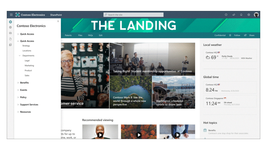
A better SharePoint Overview than provided in the app bar
If everything goes wrong, there is still the search dominant in the middle of the page. It allows you to find relevant information quicker than in the App Bar, not guaranteeing that the content will be even there.
It only delivers a limited good experience for the end-user. There are more reasons why the App Bar is not a good companion for your users.
Reason 2: Framing – Focus on content
Framing is a term from visual arts and photography. The goal of framing is often to focus the viewer’s attention upon the subject. Take a look a the following picture.

Framing use in Photography
Please show this picture to someone for 5 seconds and ask what they have seen; they likely describe the landscape and not the frame.
In computer programs and websites – the frame is the window. Elements close to the top, bottom, left, or right edges of the screen easily can get recognised as part of the framing. Like with the photo, it draws only the attention to the centre but not the frame.
The human brain is incredible to ignore irrelevant information. The app bar is such a navigational element that it falls exactly in this category.
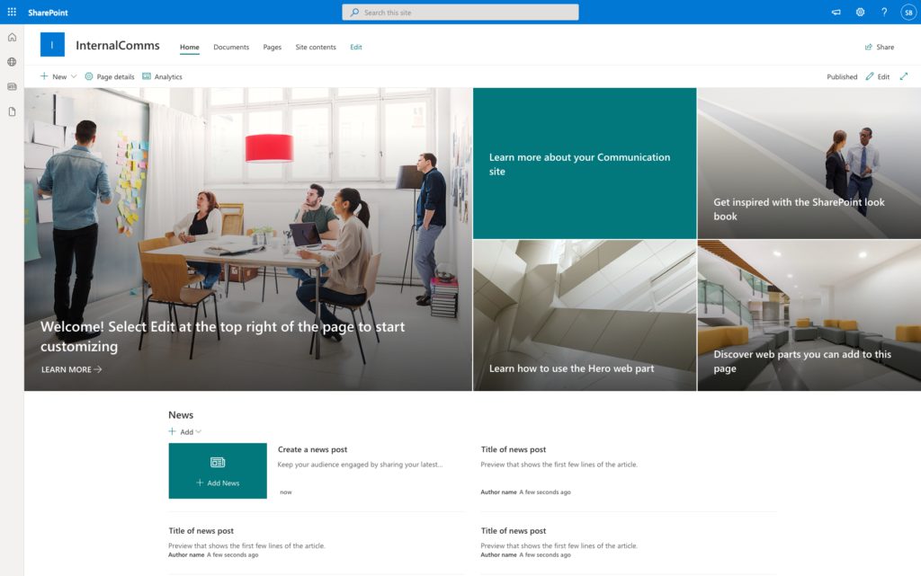
Out of the box communication site – The app bar not stand out.
This week I had somewhat like an epiphany. I was a bit concerned about the app bar always sitting on the left side, especially for SharePoint. My brain already adopted to ignore it, and I had to force myself to look at the app bar. That is just my personal experience.
Reason 3: Heatmaps
In UI/UX design, it’s always good to use heat map overlays, opacity tests or a blur-eye test to identify points of interest. The first method gives you a good indication of where the user is looking first and where the most important information is. It helps you to guide better the user’s and, therefore, serve information quicker. AI helps create a good first impression, which only a costly eye-tracking test could do. If you like to know more here is a link on how to use with Gaze Plots and Head Maps
Here is the result of such an eye-tracking simulation and the impression in the first 2.5 seconds on the page.
Gazeplot eye-tracking analysis
It means in the first 2.5 seconds; the user does not even recognise the existence of the App Bar. A better representation of this eye-tracking is, like I mentioned in the beginning, a heat map.
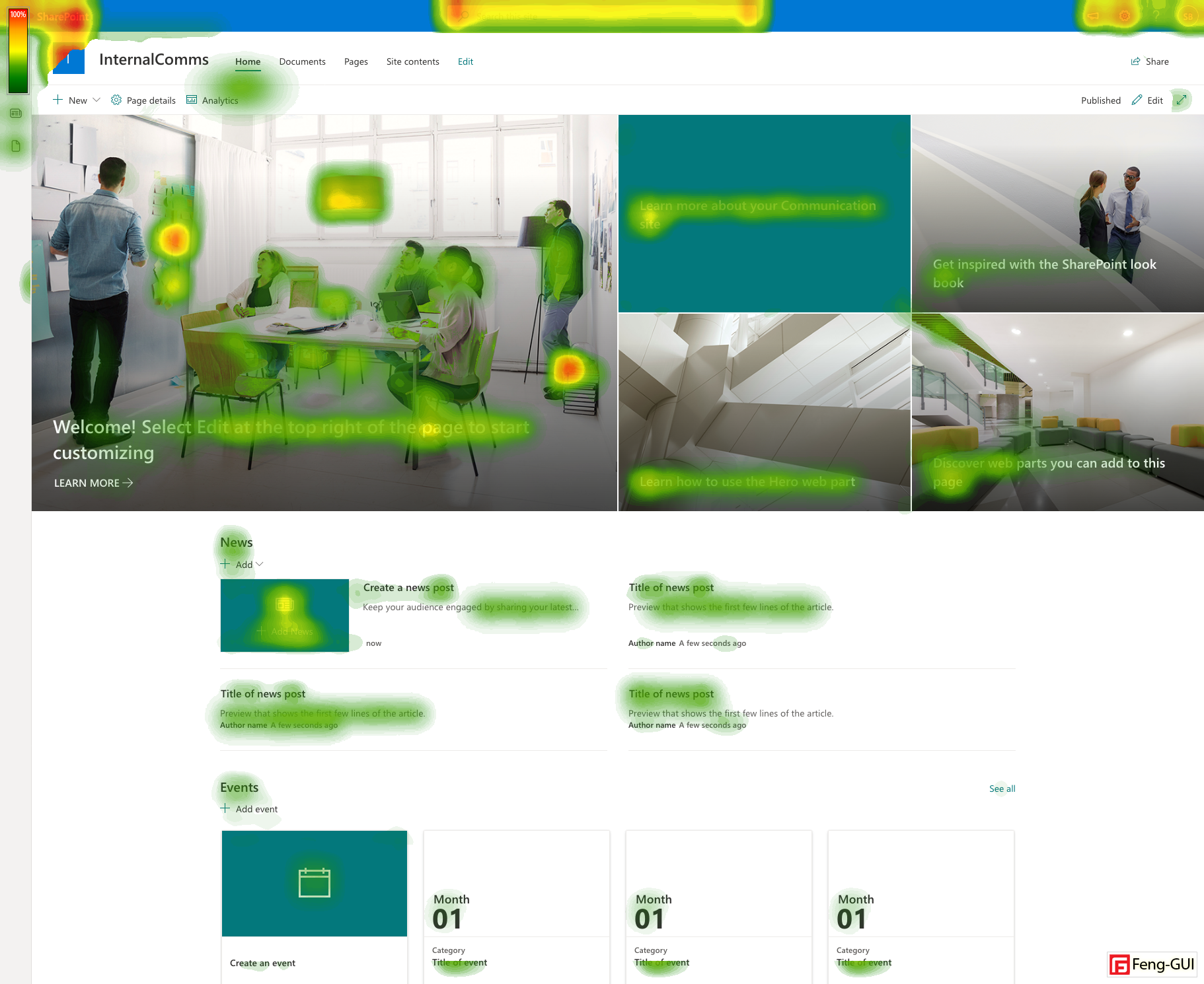
Heat map overlay on a communication site in SharePoint after 2.5s
Sadly the legend in my software overlays the app bare but beneath, there is no such thing as a bright red area that would indicate the App Bar is important.
The user might see the icons. The missing labels also do not help make more sense for the end-user of the existence of the app bar.
First, SharePoint and waffle menu, followed by content, search box, user profile, and anything else, is more important to the end-user.
The following analysis shows what the user sees on the page.
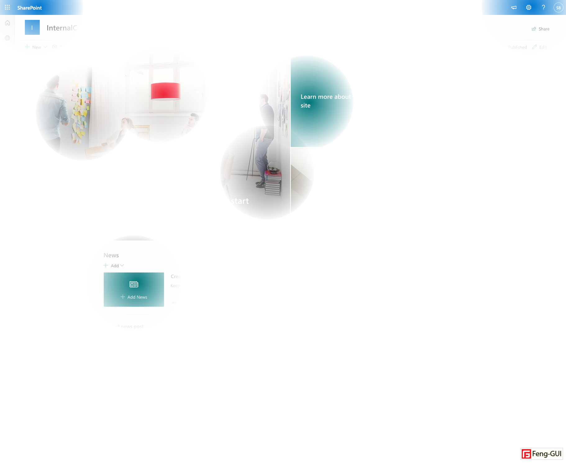
Opacity Overlay of the users first impression
It is still after 2.5 seconds, but over time this does not change a lot. Opacity report after 7.5 seconds looks like this:
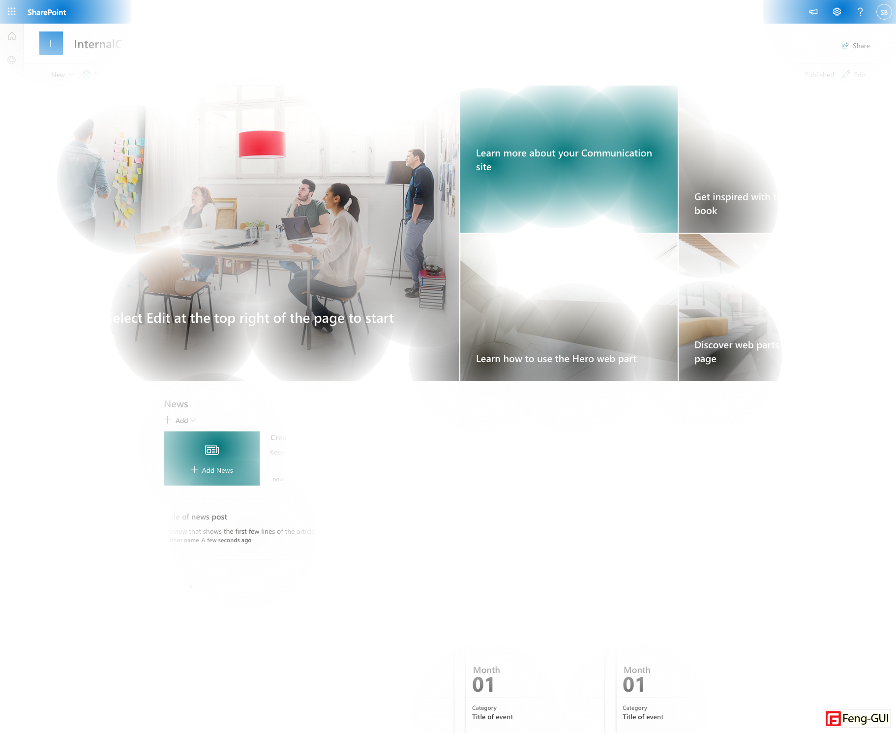
Opacity Test after 7.5s
The eye-tracking report after 7.5 seconds shows that the user gets near the App bar but never to the app bar.
Gaze plot after 7.5s
In addition, the heat map only barely changes, which means that the SharePoint App bar is no point of interest for your user at all.

Heat Map after 7.5s
Conclusion
Microsoft well thought the SharePoint app bar before its implementation. All pros and cons, the decision was made to place it there. Give the user some global navigation hub.
With explanation, convincing, and consulting of the end-user, it can serve your intranet well. Hopefully, this user education goes well for you because it is easier for users to ignore the App Bar than to use it.
With all these applications like Teams, PowerBI, Planner, and so on, which are highly interactive applications, this kind of navigation makes a lot of sense.
When it comes to mostly static web content on SharePoint intranets, sadly, not so much. Has the App Bar had a slight potential to serve as global navigation? I don’t think so; the navigation must live inside the content and not on a sidetrack.
Just because SharePoint is an app on Microsoft 365, it does not serve and behave like an app at all. It has a different purpose and got placed on SharePoint for consistency, not as a real improvement.
The functionality can be amazing, this do not help when the user not use or it at the end of the day.
All heat maps were created using Feng GUI.
Side Note: In future it would also be great to have the possibility to remove all provided information and extend it with custom functionalities. This would help to bring smaller applications, they need every day closer to the user, while maintaining the context where they are. These extension points are key for the success on rolling the side bar out to customers.