The first thing when I start a new branding project I first make myself familiar with the fonts I want to use. This is because I want to see how they work on some basic text elements an if the text is readable.
In general the overall typography is the most important factor to success of any information system or web site. 90% to 95 % on a website is dominated by text. Becoming a master on typography means you become a better web designer or SharePoint brander, but it is no easy topic and I just want to scratch the surface here but provide some good links for further information at the end.
The basic
The typography setup can be mainly defined by the following factors:
- The Font
- Font Size
- Font Weight
- Line Height
- Letter Spacing
In other words, these are our core ingredients how we can manipulate the text. For example, some fonts look great with the predefined letter spacings while others require a little bit more space in between the characters. You can also use the letter spacing to make a special effect on headlines. For some examples that a look at Helvetica, Bold, Big, Negative Letter-Spacing.
How many fonts should I use?
In general when, you plan a design it is common practice that you don’t use more than three to four different fonts. Those different fonts can be defined for:
- Headline (<h1>-<h6>)
- Paragraphs (<p>)
- Quotes (<cite><cite>, <block quote> is decrepted with HTML 5)
- Code, Navigation,…
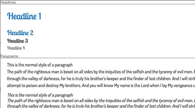
When we take a look at the out of the box design of SharePoint 2013 at least 3 different fonts was used. Those fonts are Segoe UI (for smaller text), Segoe UI Light (for large text such as headlines) and Segoe UI Semilight (<h2>-<h3>).
The fonts are part of the same font family, but have a different font weight, which is indicated by “Light” and “Semilight” and those fonts are slightly different. The typeface was adapted to the weight and are not only bold and “not so bold”. The reason why Microsoft used those different font faces was that they look great in there specific use case. Improved the readability and the overall design.
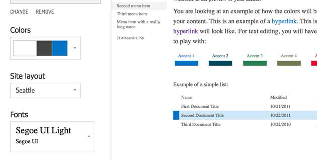
Font picker in composed look
When a theme is used in SharePoint the fonts can be changed to only a maximum of two fonts. Mostly Segoe is used for the regular text as used in a paragraph, navigation, and so on because of its good readability. The larger font in the font picker will be applied to the headlines only.
Reset and Reapply fonts using CSS
When a web design is created from scratch it is fairly simple to reset the fonts. All that needs to be done is to apply a base font to the body tag and additional fonts for the headlines.
@import url(http://fonts.googleapis.com/css?family=Dosis:500);
@import url(http://fonts.googleapis.com/css?family=Lobster+Two);
body{
    font-family: 'Dosis';
}
h1, h2, h3, h4{
    font-family: 'Lobster Two';
}
HTML Typographic Template
In SharePoint this only partially works because some elements will still have the Segoe font applied. For a full change of the body font some additional classes need to be added.
@import url(http://fonts.googleapis.com/css?family=Dosis:500);
@import url(http://fonts.googleapis.com/css?family=Lobster+Two);


body, .js-callout-body, .ms-calloutLink:link, .ms-calloutLinkDisabled, .ms-commandLink, .ms-commandLink:visited,
.ms-core-defaultFont, .ms-core-listMenu-heading, .ms-core-listMenu-heading, .ms-tv-header, .ms-core-listMenu-verticalBox > .ms-core-listMenu-root > li > .ms-core-listMenu-item, .ms-core-listMenu-verticalBox > .ms-core-listMenu-root > li > .ms-core-listMenuEdit, .ms-core-navigation, .ms-core-pageTitle, .ms-core-pageTitle, .ms-core-pageTitle a, .ms-descriptiontext, .ms-metadata, .ms-secondaryCommandLink, .ms-secondaryCommandLink:visited, .ms-status-msg, .ms-textLarge, .ms-textXLarge, .ms-textXLarge, body, .ms-tv-header, .ms-webpart-titleText > a, .ms-webpart-titleText.ms-webpart-titleText, .o365cs-nav-header .o365cs-nav-navIcon .o365cs-nav-header .o365cs-nav-navIcon, body, .o365cs-nav-header .o365cs-nav-navItem, #pageStatusBar, a.ms-calloutLink:visited{
    font-family: 'Dosis';
}
h1, h2, h3, h4{
    font-family: 'Lobster Two';
}
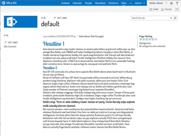
Changed Typography in SharePoint
So we now have two different styles that need to be applied differently to the Apps (first snippet) and SharePoint (second snippet). Both are probably stored in different style sheet files and we still don’t have any additional properties such as line height, font size or font weight applied to the fonts.
Finally and whats next
The two different style definitions cry for something more flexible and yes we can do this in SASS. By assigning variables we will be able to define the typography as global settings that are easy to change. Then we don’t have to care or worry about those style sheet classes.
In the meantime, you can do a test run and add the SharePoint Style Sheet from this blog post to your master page. If you want to get a little bit deeper into typography you can read the following resources.