Article
3 comments

Disable “SharePoint plugin cannot be loaded” on public facing web sites

Recently I stumbled upon various sites that are built on SharePoint 2013. All those sites have the same problem. The SharePoint plugin that those web sites try to load is only useful for collaboration but not for public facing web sites.

Plugin request in Safai

Safari and SharePoint on MacOS X

Plugin Cannot be loaded in Chrome

Chrome requests for plugin

Origin of the message

This message comes from a client side JavaScript and tries to load the presence information. To avoid this message the following lines of code needs to be added to the master page or via a JavaScript file.

function ProcessImn() {}
function ProcessImnMarkers() {}

The code to request the plugin won’t be executed anymore. The visitor can enjoy the web site instead of concentration on the source of the error message.

Using SharePoint from MacOSX? Use Safari. This is because if Office and Lync are installed on MacOS special web extensions will be installed to support working with SharePoint better.

Additional information:

Article
4 comments

Remote form customization: Passing data to a modal dialog – Part 1

Let’s jump right into the topic how it is possible to pass data to a modal dialog. On first sight it looks like a complex task but after you read this article you will get an overview how it works. In this simple scenario I use a HTML Form web part with a text box and a hyperlink. The value then should be passed to the new form dialog of a custom list called “Cars”.

Opening the modal dialog

In general there are two ways to open a modal dialog.  The asynchronous and the synchronous way to open a modal dialog, but here I use the synchronous way to keep the code simple.

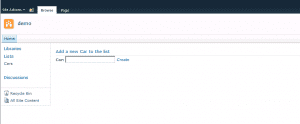
The setup for this scenario is simple. First I created a custom list named “Cars” and this list has nothing more than the default title field. After that I added a new HTML Form Web Part to the landing page of my demo site. Then I added a simple form to the web part. It consists of a textbox with the id “newcar” and a hyperlink with the id “create” to create a new entry. This form also loads JQuery from the CDN and the custom script that is needed to pass the value of the input field to the modal dialog.

html form web part

HTML Form web part that should pass the values to the modal dialog

The code of the form looks like this:

<script src="http://code.jquery.com/jquery-1.9.1.min.js"></script>
<div>
    <b>
    Car:
    </b>
    <input type="text" id="newcar" value="" />
    <a href="/sites/demo/Lists/Cars/NewForm.aspx" id="create">
        Create
    </a>
</div>


First the click event on the hyperlink needs to be registered to open a modal dialog. Then the data from the textbox needs to be passed to the title field of the modal dialog.

var childDialog = null;

$(document).ready(function(){

    // register event handler to open the modal dialog
    $("#create").on("click", OpenNewFormInDialog);

});

var OpenNewFormInDialog = function(e){
    // Disabling the default hyperlink behavior
    e.preventDefault();

    // Get the form url from the link
    var formUrl = $(this).attr("href");

    // Setting the option of the modal dialog   
    var options = {
        title: "New Car",
        url: formUrl
    };

    // Open the new dialog
    SP.UI.ModalDialog.showModalDialog(options);

}

So far so good this all no rocket science but how do we get the data to the form? Therefor a little trick is needed. The function “SP.UI.ModalDialog.get_childDialog()” will return the last loaded modal dialog. The modal dialog object returned by this function has a special property named $c_0. Once the dialog has been loaded it contains the content of the modal dialog. All that needs to be done is to recheck this property during the loading of the dialog. This can be accomplished with a simple recursive call that pauses for 100 milliseconds, in my case, and check the property again. If this is set then the loading has been completed.

...

    // Open the new dialog
    SP.UI.ModalDialog.showModalDialog(options);

    // Get the child dialog
    childDialog = SP.UI.ModalDialog.get_childDialog();

    // Check the loading state
    CheckDialogState();

}

var CheckDialogState = function(){

    // check if dialog is fully loaded
    if (childDialog.$c_0 != undefined || childDialog.$c_0 != null) 
    {
        // get title value from textbox
        var titleValue = $("#newcar").val();

        // load document from modal dialog into a jquery object;
        var dialogContent = $(childDialog.$c_0);

        // find title field in dialog by it's title value
        var titleInputField = dialogContent.find("[title=Title]");

        // setting the title field
        titleInputField.val(titleValue);

    }
    else 
    {
        // Wait for 100ms and then check again
        window.setTimeout("CheckDialogState();", 100);
    }

}
...

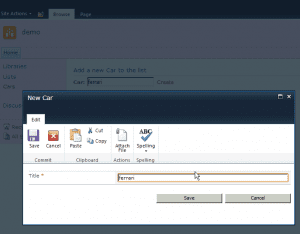
After the content has been loaded all that needs to be done is to parse the property to a JQuery object. Once it is accessible in JQuery the value of the form web part input field can be added to the title field of the new form. The result can be seen in the following screenshot.

modal dialog after the values have been passed

Modal dialog after the values have been passed to the modal dialog

Further user experience enhancement

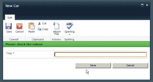
A nice additional feature when data will be passed to a modal dialog is to tell the user to check the values. This can be done using the page status bar for example. The problem here is that the status bar cannot be enabled with the SharePoint function SP.UI.Status.addStatus.

Previously we already loaded the content to a JQuery object, so we can do further manipulation of the output of the modal dialog. SharePoint renders on default a placeholder for that page status with the id “#pageStatusBar”. The code to show the page status looks like this:

...
        // add message to page status bar and toggle the display to be shown
        dialogContent.find("#pageStatusBar").html("<strong>Please check the value</strong>")
        dialogContent.find("#pageStatusBar").toggleClass("s4-status-s2").css("display", "block");

        // resize the modal dialog.
        childDialog.autoSize();
...

At the end I forced the modal dialog to resize itself to avoid possible scrollbars.

Modal dialog with page status

Modal dialog with page status

If you have any suggestions or question please feel free to provide some feedback. As always you can download the html form web part in the link below.

Download the web part: Modal dialog part 1

Please make sure to change the path of the new form

Article
1 comment

Remote form customization in modal dialogs

You might know this situation, when you like, for example, pass a query string to a modal dialog to preselect values in a list form. With SharePoint Designer or custom development this is an easy task. What if you like to customize the form without permanently modifying the form itself?

In this post series I will show my newly discovered way to have better control over forms.

How come? Well over the last week I had the request once again, to pre-fill a list form with values from another list. So I was thinking to myself that there must be a better ways to do this task. Lucky me I found one.

In the next posts I will first introduce you to the basic concept of this kind of customization.

The series is planned to contain the parts:

In all these parts the customisations will be done using JavaScript / JQuery and our best friend SP Services, when it comes to SharePoint customization. In all those part I leave the form dialogs untouched. No additional web part on the forms will be used.

Hope you enjoy this series and maybe I will add some additional chapters at the end.

Article
68 comments

Build a flexible mega drop down navigation for SharePoint

I’ve read a lot of good articles about mega menus or mega drop in the past. They all were from a technical point of view correct and useful introduction about the basics behind. When it comes to SharePoint you should always consider the user and how they can administer or change the design on their own. This is one of the strengths in SharePoint and the user should always be in the center of every solution. For a mega menu it doesn’t take much to accomplish. This can be done easily in SharePoint Designer or Visual Studio. Choose your weapon of choice and spend 30 Minutes to build up a simple but powerful mega menu.

The ingredients and how they work together

In general a mega menu is nothing more than an HTML Snippet that will be loaded when a user hover over a navigation item. This can be the top navigation or in SharePoint terms the quick launch navigation. For embedding to the quick launch the code only needs to be slightly changed.

The base of the mega menu is a customized article page that has a web part zone for the drop down content. The navigation is the out of the box navigation that should be extended for the following tasks

  • Hover over a navigation item
  • Grab the link URL
  • Load the linked page
  • Cut out the required web part zone
  • Add it to the page as the content of the mega drop down

To accomplish those tasks the well-known JavaScript library Jquery will be used.

The article page

In general to define the content of the mega menu any mega menu can be used as a starting point. The only thing that needs to be done is to encapsulate any web part zone into a <div> element.
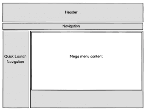
Mockup Mega Drop Down Article Page

Mockup Mega Drop Down Article Page

The code for this is simple and looks like this:

...
<ContentTemplate>
 <div class="article article-right">
 <PublishingWebControls:EditModePanel runat="server" CssClass="edit-mode-panel">
 <SharePointWebControls:TextField runat="server" FieldName="Title"/>
 </PublishingWebControls:EditModePanel>
 <div class="n8d-dropdown" id="megadropdownitem">
 <WebPartPages:WebPartZone runat="server" AllowPersonalization="false" ID="TopZone" FrameType="None" Title="<%$Resources:cms,WebPartZoneTitle_Top%>" Orientation="Vertical" />
 </div>
</ContentTemplate>
...


The script that performs the mega menu magic will simply grab the defined <div> element with all the content in it and adds it to the navigation. Then the author will be able to add content to their demand or change existing content without any single line of code. The only thing that needs to be defined is styled to show the content in a proper way.

The master page

The second thing that is required for this solution is a master page. This is only needed to register the required styles and Jquery scripts. In the default configuration of the master page SharePoint already have a fly out navigation.

....
 <script src="http://ajax.aspnetcdn.com/ajax/jQuery/jquery-1.8.2.min.js" type="text/javascript"></script>
 <script src="/_layouts/n8d.MegaMenu/MegaMenu.js" type="text/javascript"></script>
 <link type="text/css" href='/_layouts/n8d.MegaMenu/MegaDropDown.css' rel="stylesheet" />
...

To avoid possible conflicts with the script, the navigation control needs to be modified. This can be done by changing the properties for the MaximumDynamicDisplayLevels. It needs to be set from the default value which is 1 and needs to be set 0. This means that no dynamic children will be rendered.

...
<asp:ContentPlaceHolder id="PlaceHolderHorizontalNav" runat="server">
 <SharePoint:AspMenu
 ID="TopNavigationMenuV4"
 Runat="server"
 EnableViewState="false"
 DataSourceID="topSiteMap"
 AccessKey="<%$Resources:wss,navigation_accesskey%>"
 UseSimpleRendering="true"
 UseSeparateCss="false"
 Orientation="Horizontal"
 StaticDisplayLevels="2"
 MaximumDynamicDisplayLevels="0"
 SkipLinkText=""
 CssClass="s4-tn" />
   <SharePoint:DelegateControl runat="server" ControlId="TopNavigationDataSource" Id="topNavigationDelegate">
     <Template_Controls>
       <asp:SiteMapDataSource
        ShowStartingNode="False"
        SiteMapProvider="SPNavigationProvider"
        id="topSiteMap"
        runat="server"
        StartingNodeUrl="sid:1002"/>
     </Template_Controls>
   </SharePoint:DelegateControl>
</asp:ContentPlaceHolder>
...

Now that the base setup is done it’s time for some JQuery magic.

The Mega Menu Script

As mentioned before the script doesn’t do much. So when the page is loaded JQuery grabs all URL from the top navigation and looks for content that should be added to the navigation. This will be done by inserting a new <div> element directly on every item of the top navigation. This will be done by the following function.

var loadingData = function(){

    var navigationElement = $(this);
    var link = $(this).attr("href");
    var text = $(this).find(".menu-item-text").text();
    $(this).attr("linkname", text);

    $.ajax({
            url: link,
            async: false,
            dataType: "html",
            success: 
                function (data) {
                    content = $(data).find("#megadropdownitem");
                    
                    if(content.html() != undefined){
                        // fix content for calender
                        content.find(".ms-WPBody").each(function () {
                            $(this).removeAttr("webpartid");
                            $(this).removeAttr("class");
                            $(this).removeAttr("id");
                        })
                        newContent = "<div class='mdd-itemcontent'><div class='mdd-innercontent'>"+content.html()+"</div></div>";
                        navigationElement.parent().prepend(newContent);
                    }
                }
    });

}

For the animation of the flyout i simply added a hover binding to all of the navigation items.

$(document).ready(function(){

    var pageMode = $("#MSOSPWebPartManager_DisplayModeName");

    if(pageMode.val() == "Browse"){
        $(".s4-tn li.static a.static").each(loadingData);
        $(".s4-tn li.static").hover(showFlyOut, hideFlyOut);
    }
});

var showFlyOut = function(){
    if($(this).children(".mdd-itemcontent").html() != null){
        $(this).children(".menu-item").toggleClass("hover");
        $(this).children(".mdd-itemcontent").slideDown("fast");
    }
}

var hideFlyOut = function(){
    if($(this).children(".mdd-itemcontent").html() != null){
        $(this).children(".menu-item").toggleClass("hover");
        $(this).children(".mdd-itemcontent").slideUp("fast");
    }
}

The functions showFlyout and hideFlyout will show and hide the mega menu / flyout and also the class of the current selected navigation item will be toggled for a better styling. The last step was to add the design for the menu. After that the mega menu looks like this.
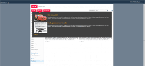
Finished look of the mega drop down

Finished look of the mega drop down

Let me show you how the solution works in the following video.

How to create a mega menu navigation in SharePoint from Stefan Bauer on Vimeo.

As seen in the solution the content of the mega drop down is flexible. Static or dynamic content can be added without changing the core functionality. No server side code is required, which makes it easy to adapt for SharePoint 2013. By changing the style sheets the form of the drop down can be easily adapted. While I used visual studio to deploy my solution this functionality can be added by using SharePoint Designer too. I think the most time consuming task in my mega menu solution are the design adoption but a simple drop down menu can be accomplished in 30 minutes. Would be great if you can share your experience with my solution. Finally what’s left to say have fun in creating you own variations.

Update Nov 19, 2013: Bugfix Calendar Web Part

As David Foster and Scott McLeod pointed out in the comments there is an error when a calendar will be used. The items were delegated to the mega menu instead of the list web part. The solution below is updated and contains the fixed version.

Download Visual Studio Solution

Article
82 comments

Turn summary link web part into an accordion

In SharePoint the summary link web part is a great tool to create overviews made of internal and external links. The challenge with this web part is to enhance the presentation when a lot of links will be added to this web part. In this post I will present how to turn this basic web part to an accordion which gives the user a much better experience.

Styling the summary link web part

First of all I created a simple summary link web part and added grouping of those links. As you see the amount of links are not that much but enough that specific links are hard to read and find the belonging groups as well.

summary link web part

summary link web part

To enhance the default style I simply added a content editor web part to the page that contains my new style definition. To improve the group header I simply added a style definition for the CSS class “groupheader”. I also added some styling for the links as well.

.groupheader{
	background-color: #0072C6;
	color: white;
	font-family: "Segoe UI", Tahoma, Geneva, Verdana, sans-serif;
	font-size: 140%;
	padding: 0.5em;
	padding-left: 0.75em;
	margin-right: 0.5em;
	margin-bottom: 1px;
}

.groupmarker:hover .groupheader{
	cursor: pointer;
	background-color: #0597FF;
}

.dfwp-list{
	background-color: #0072C6;
	margin-bottom: 0.5em;
	margin-right: 0.75em;
}
.dfwp-list .item:hover{
	background-color: #0597FF;
}
.dfwp-list .link-item a{
	margin-left: 2em;
	color: white;
}

The style definitions transform the web part now into a metro styled web part. For the user experience I also added a hover effect using CSS. This allows to highlight the currently selected link.

styled summary link web part

styled summary link web part

Add accordion script

The turn this web part now into a fully functional accordion all that needs to be done is to add a simple Jquery script the performs the following tasks.

  • Hide all hyperlinks in the groups
  • When a user clicks a group header
    • Hide all sections that is not the current header
    • Expand current selected link section

This can be accomplished with the following code.

$(document).ready(function(){

		/* Slide up all link items and hide them */
		$(".dfwp-list").slideUp("fast");
		/* Binding a click event handler to the links: */
		$('.groupheader').click(function(e){

			/* Finding the drop down list that corresponds to the current section: */
			var dropDown = $(this).next(".dfwp-list");

			/* Closing all other drop down sections, except the current one */
			$('.dfwp-list').not(dropDown).slideUp('slow');
			dropDown.slideToggle('slow');

			/* Preventing the default event (which would be to navigate the browser to the link's address) */
			e.preventDefault();
		})
})

Now the web part has turned into an accordion with expandable sections, but there is one last step to do. The accordion is currently not editable but this can be fixed with a simple modification of the script.

Make accordion editable again

SharePoint has something called display mode. This display mode indicates how a user has opened a page and can have the following values:

  • Browse – indicates that the user views the page
  • Design – indicates that the user tries to edit the page

Normally this form context or display mode is use is web part development but it could be used and detected using Jquery. SharePoint renders a hidden input field with the id ”MSOSPWebPartManager_DisplayModeName” that will be set to the appropriate value.

For example the field can look like this if the page is opened in browse mode.

<input type="hidden" name="MSOSPWebPartManager_DisplayModeName" id="MSOSPWebPartManager_DisplayModeName" value="Browse" />

To restore the edit function all that needs to be done is to wrap the script and let it only get executed in browse mode.

$(document).ready(function(){

	// Detect if user view or edit the page
	if($("#MSOSPWebPartManager_DisplayModeName").val() == "Browse"){
		// Register accordion
		accordion();
	}

})

var accordion = function(){

	/* Do fancy easing */
	$.easing.def = "easeOutBounce";

	/* Slide up all link items and hide them */
	$(".dfwp-list").slideUp("fast");
	/* Binding a click event handler to the links: */
	$('.groupheader').click(function(e){

		/* Finding the drop down list that corresponds to the current section: */
		var dropDown = $(this).next(".dfwp-list");

		/* Closing all other drop down sections, except the current one */
		$('.dfwp-list').not(dropDown).slideUp('slow');
		dropDown.slideToggle('slow');

	})
}

The last thing I want to show is the accordion live in action.

Download Accordion Content Editor Web Part – SharePoint 2007 / SharePoint 2010

Article
3 comments

Close SharePoint Modal Dialogs with “Esc”-Key press

Whenever a list items will be checked or reviewed in SharePoint a modal dialog come up. This feature of SharePoint 2010 is really helpful from a usability point of view, because the user is able to return to the list where the interaction with the list item has been started by closing the modal dialog. When this will be done a couple of times a day, the user will always have to move the mouse pointer to the close button to close the dialog.

As user learned over the last couple of year, when the user want something to go away that pops out of the current browser window, no matter if it is a modal dialog, image or full screen video the use only have to press the “Esc”-Key to make it go away.

As I mentioned before this is not implemented in SharePoint now, but could be changed with a simple JavaScript and the usage of the Modal Dialog Framework implemented in SharePoint. To add this functionality I created a simple sandbox solution, which has a module and a JavaScript.

First of all the elements.xml contains the following definition:

<?xml version="1.0" encoding="utf-8"?>
xmlns="http://schemas.microsoft.com/sharepoint/">
  <CustomAction
      ScriptSrc="~sitecollection/Style Library/FetchKeyStroke/CloseDialogOnEsc.js"
      Location="ScriptLink"
      Sequence="102"
      ></CustomAction>
  <Module Name="FetchKeyStroke" Url="Style Library">
    <File Path="FetchKeyStroke\CloseDialogOnEsc.js" 
          Url="FetchKeyStroke/CloseDialogOnEsc.js" />
  </Module>
</Elements>

The custom action register a JavaScript on the Master Page. The module definition deploy the JavaScript file the style library, the location for the deployment is URL parameter on the module. The JavaScript file only has few lines of code that capture the ESC-Key press  and close the mos recent dialog. The rest could be found in the following script.

document.onkeypress = function(e) {
    e = window.event || e;

    // Check if ESC-Key is pressed
    if (e.keyCode == 27) {

        // Check if a dialog was recently opened
        var dialog = SP.UI.ModalDialog.get_childDialog();
        if (dialog != null) {
            // Try to close the dialog
            SP.UI.ModalDialog.commonModalDialogClose(SP.UI.DialogResult.cancel,
                "Closed by ESC");
        }
    }
}

Conclusion

With this simple solution I think the usability in SharePoint could be improved a bit and based on SharePoint components like the modal dialog framework. jQuery would be to overweight for this task.

You can download the visual studio solution as well as the sandbox solution.

After the solution deployment a the site collection feature “Close Dialog on Esc-Key press” needs to be activated. In the Style Library the new added JavaScript file needs to be checked in.