
When your application or webpart requires a modal dialogue, you might use the package @microsoft/sp-dialog based on this tutorial on how to use it. There is nothing wrong with this solution but something out of time.
HTML Dialog Element
For more than a decade, HTML has already included a native HTML Dialog Element. Using this element has many benefits, such as user-agent CSS that ensures the dialogue always gets centred on the screen.
A modal dialogue using this HTML Element is also fairly simple to implement. Let me show you how.
SharePoint Framework Sample on Modal Dialog
While this method can be easily transferred into ReactJS, too, I’d like to keep it simple and use native HTML instead. Therefore the only code we need to have is to create what I call a ‘placeholder’ component.
In the render method of this web part, all I need to do is to import my placeholder component,
import Placeholder from './components/Placeholder';
And add it to the webparts ‘domElement’ property in the render method of the webpart.
public render(): void {

  const placeHolder = new Placeholder("");
  this.domElement.appendChild(placeHolder.getPlaceholder())

}
The magic happens in the placeholder component.
The Placeholder Dialog launcher component
I created a new component folder inside the webpart’s root folder and added a ‘Placeholder.ts’ with the following boilerplate code.
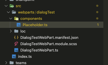
VS Code – location of boilerplate
export default class Placeholder {

  constructor(content?: string) {
  }

  public getPlaceholder(): HTMLElement {
  }

}
getPlaceholder will return the HTML to the webpart container.
We now need a couple of new elements inside the class to create the dialogue.
- A
<button>– that launches the dialog - A
<dialog>– the dialog element - A container to render
<button>and<dialog>.
export default class Placeholder {

  private _container: HTMLElement;
  private _btnShowDialog: HTMLButtonElement;
  private _dialog: HTMLDialogElement;

  constructor(content?: string) {

    // Button launch dialog
    this._btnShowDialog = document.createElement("button");
    this._btnShowDialog.innerHTML = "Show Dialog";
    this._btnShowDialog.addEventListener("click", this.showDialog.bind(this));

    // The dialog content
    this._dialog = document.createElement("dialog");
    this._dialog.innerHTML = "<h1>This is just a fancy new Dialog</h1>";

    // a container to host button and dialog
    this._container = document.createElement("div");
    this._container.appendChild(this._btnShowDialog);
    this._container.appendChild(this._dialog);

  }

  public getPlaceholder(): HTMLElement {
    return this._container;
  }

}
Now we can render the webpart, but not yet the dialogue.
Next, we need to launch the dialogue.
Launching the dialogue
To open the dialogue, we need to add some extra code. First, we need to have an event handler on the button.
constructor(content?: string) {

  // Button launch dialogue
  this._btnShowDialog = document.createElement("button");
  this._btnShowDialog.innerHTML = "Show Dialog";
  this._btnShowDialog.addEventListener("click", this.showDialog);
  //...

}
We also need to implement the event.
public showDialog = (event: Event): void => {

  // Open Dialog
  (this._dialog as any).showModal();

}
Sadly the ReactJS version and the typescript types included in the SharePoint Framework don’t know anything about the </dialog><dialog> element, even thou HTML and browsers have supported this for a long time. This fact required casting the HTMLDialog to any to call the showModal() dialogue.
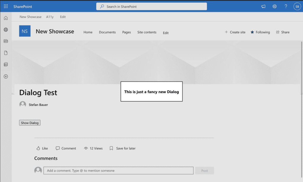
First Launch of modal dialog
With this code in place, we now launch a modal dialogue inside SharePoint, Teams or wherever you need it.
Closing the Dialog
Well, we can open the dialogue but cannot close it. Let’s add two more buttons, one to ‘pseudo-save’ the dialogue and one to ‘pseudo-cancel’ the dialogue.
private _btnShowDialog: HTMLButtonElement;
private _btnSaveDialog: HTMLButtonElement;
private _btnCancelDialog: HTMLButtonElement;

constructor(content?: string) {

    //...

  // Save and Close dialog
  this._btnSaveDialog = document.createElement("button");
  this._btnSaveDialog.innerHTML = "Save";
  this._btnSaveDialog.addEventListener("click", this.saveDialog);

  // Cancel and Close dialog
  this._btnCancelDialog = document.createElement("button");
  this._btnCancelDialog.innerHTML = "Cancel Close";
  this._btnCancelDialog.addEventListener("click", this.cancelDialog);

    //...
}
Of course, we need to implement those event methods, which are simple too.
public saveDialog = (event: Event): void => {

  (this._dialog as any).close();

}

public cancelDialog = (event: Event): void => {

  (this._dialog as any).close();

}
In either case, we only need to close the dialogue.
This close works great so far, and in both cases, the dialogue gets closed, but how do we know that it happened in the dialogue?
Working with the return value or dialogue result
To know what happened in the dialogue, this HTML Element has a returnValue attribute that can be sent or set by a form.
Let’s extend the previously created functions and pass a value to the ‘close’-function.
  public saveDialog = (event: Event): void => {

    (this._dialog as any).close('Save Results');
    this._elemOutput.value = (this._dialog as any).returnValue;

  }

  public cancelDialog = (event: Event): void => {

    (this._dialog as any).close('Cancel Dialog');
    this._elemOutput.value = (this._dialog as any).returnValue;

  }
saveDialog pass in ‘Save Results’ and cancelDialog pass in ‘Cancel Dialog’.
To show the result, I used an <output> HTML (see how it works on MDN) element.
See how this came all together now.
Conclusion
Suppose you want to be flexible and create a Modal dialogue wherever needed. There is no requirement anymore to use any framework for that because HTML supports it out of the box.
With the use of return value, you cannot only return simple things like string, but you can also detect the changed values or manually pass back objects to the rest of the code.
While we looked only at the out-of-the-box styling without any CSS, you can style the dialogue however you like. In an upcoming blog post, I will also show you some tricks to style the dialogue.
One article I would highly recommend reading is Modal & Nonmodal Dialogs: When (& When Not) to Use Them by Nielsen Norman Group to make educated considerations.
Finally you will find the full code here HTML Dialogs.
Continue reading on how to position the dialog on SharePoint Pages