There are many ways to react to layout changes in HTML. You can use Resize Observers, Intersection Observer or Mutation Observers.
Those observers are great, but they come with a significant impact on the performance. You might have seen this when you resize your browser window, and the layout does not change immediately. All these observers have their place and use cases when to use them.
When it comes to a simple layout change, you can use CSS Media Queries in CSS. If you need to execute a function that enhances the mobile experience, you can do exactly the same using a CSS media query. Here is how you do it.
Step 1 is to define a string for the media query.
const mediaQuery = 'screen and (max-width: 1024px)';
The media query checks if your browser window on the screen is not bigger than 1024px.
Step 2 we need to make the current window aware of the media query and check if the window is smaller than 1024px.
const mql = window.matchMedia(mediaQuery);
This matchMedia returns an object of type MediaQueryList which has a function named matches.
It brings us to step 3 check the media matches. For that, we have a property on the media query list.
if(mql.matches){
  // Yes - smaller than 1024px
} else {
  // No - larger than 1024px
}
This check enables you to run different functions if the media query matches the current criteria or not. Sadly do not enable us t react to changes.
We would need an event listener, leading to step 4.
mql.addEventListener('change', mediaChanged);
This register a ‘change’ event to the Media Query List and calls the function ‘mediaChanged’, which does the same as we did before. Check if the media query matches – Step 5.
const mediaChanged = (e) =>{
    // Does the Media Query matches?
    if (e.matches) {
          // Yes - smaller than 1024px
    } else {
          // Yes - larger than 1024px
    }
}
The event properties ‘e’ holds the current state of the media query, and the change event only fires in case the match changes.
Here is a Codepen that allows you to try this out yourself.
How to use it in SharePoint Framework
The same method can use SharePoint Framework web parts and extensions too. The code for that is pretty much straightforward.
export default class DomResearchWebPart extends BaseClientSideWebPart<IDomResearchWebPartProps> {

  // Media query parameters
  private mediaQuery: string;
  private mql: MediaQueryList;


  // Execute on mobile devices
  private _changeMobile = () => {
    console.debug('Writing content.....<h1>YOU ARE ON MOBILE</h1>')
    this.domElement.innerHTML = '<h1>YOU ARE ON MOBILE</h1>';
  }

  // Execute on desktop
  private _changeDesktop = () => {
    console.debug('Writing content.....<h1>YOU ARE ON DESKTOP</h1>')
    this.domElement.innerHTML = '<h1>YOU ARE ON DESKTOP</h1>';
  }

  // Check and execute when mediaQuery changes
  private mediaChanged = (e) => {

    console.debug('Media Query', this.mediaQuery, 'matches?  ', e.matches)

    if (e.matches) {

      this._changeMobile();

    } else {

      this._changeDesktop();

    }

  }

  constructor() {

    super();

    // Register media query
    this.mediaQuery = 'screen and (max-width: 768px)';

    // Check the current state of mediaQuery
    this.mql = window.matchMedia(this.mediaQuery);

  }

  public render(): void {

    if (this.mql.matches) {
      this._changeMobile()
    } else {
      this._changeDesktop();
    }

  }

  protected onInit(): Promise<void> {
    return super.onInit();
  }

  protected get dataVersion(): Version {
    return Version.parse('1.0');
  }
}
I changed the media query for this slightly to a smaller size of 768px, but you can change it to any screen size and even different media such as print.
Take a look at how this works.
With the code above, you will see how the media query changes are affected in your console.
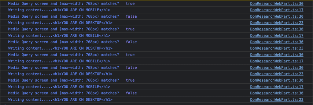
Console logs of media changes
The browser fires the event listener only when the match changes, not on every occasion the screen resolution changes. This fact makes it blazing fast and gives your web parts a performance improvement even over the first-party web part.
When to use this method
There are multiple scenarios where this pattern is useful. Assign special CSS classes only required at a certain breakpoint or execute special functions. You could also load different ReactJS Components. The possibilities are endless, harming your client’s performance and the user experience.