We all know this during our daily work a customer wants to have different colors for his status field to highlight red for a critical status and a green status for everything is ok.
The new list formatting feature in Microsoft Lists is easy for an end-user to accomplish.
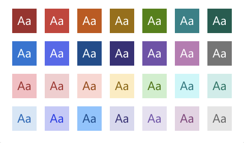
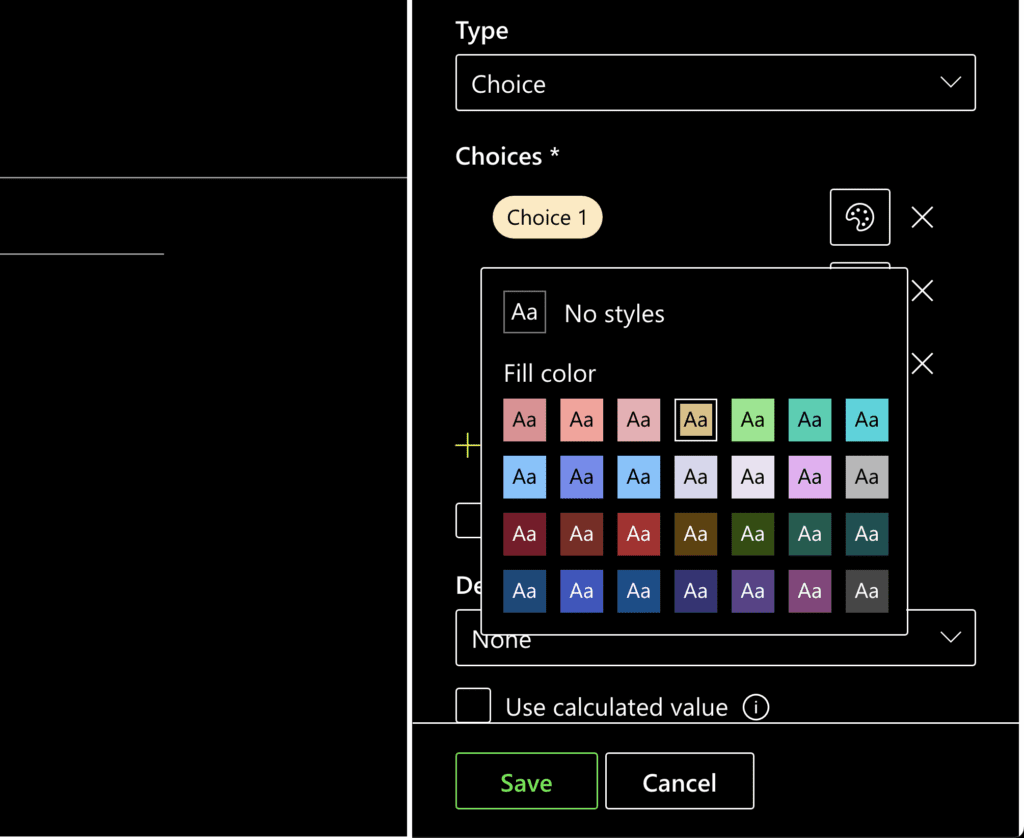
Possible colors in Microsoft List Formating
In my case, I create a project template with many lists and all different kinds of fields. The thing with my design background I struggled with was choosing the right colors in case of accessibility.
While the colors in the picker look beautiful, they might not be useful for all people. When your professional goal is to create great accessibility in everything you do, you have the right feeling about which colors to pick. Nevertheless, it might get tricky because what is accessible for me might not be accessible for you. Good that we have guidelines on the web that help you.
Minimum contrast ratio success criteria
The world wide web consortium that defines all rules and guidelines for the web has a complete catalog of accessibility success criteria. One of these criteria is the contrast ratio between text and the background of visual elements.
The rule defines a Success Criterion 1.4.3 Contrast (Minimum).
It states the following:
The visual presentation of text and images of text has a contrast ratio of at least 4.5:1, except for the following:
Large Text
Large-scale text and images of large-scale text have a contrast ratio of at least 3:1;
Incidental
Text or images of text that are part of an inactive user interface component, that are pure decoration, that are not visible to anyone, or that are part of a picture that contains significant other visual content, have no contrast requirement.
Logotypes
Text that is part of a logo or brand name has no contrast requirement.
The minimum contrast ratio should be 4.5, especially when it comes to the fields in a SharePoint list where the text is small and cannot get resized (Rule 1.4.4) and only get zoomed.
Calculating the contrast ratio can become a bit complex, and relying on your gut feeling is not what I wanted to do. Lea Verou, a web developer who I have followed for a long time, created a great and simple tool to calculate the contrast ratio.
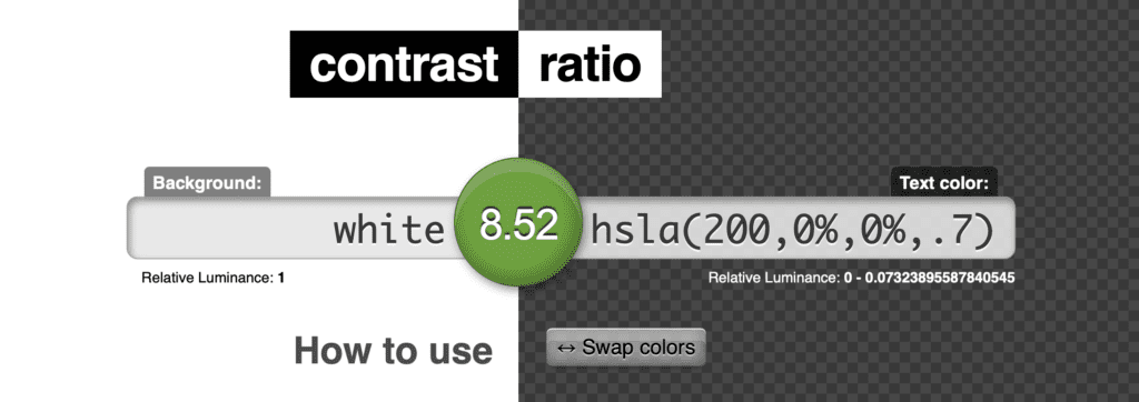
Contrast Ratio Calculator by Lea Verou.
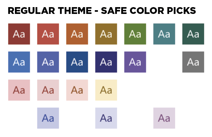
After calculating all the contrast ratios between fore- and background, I was able to identify some colors you should not pick. Those have a red label in the following chart.
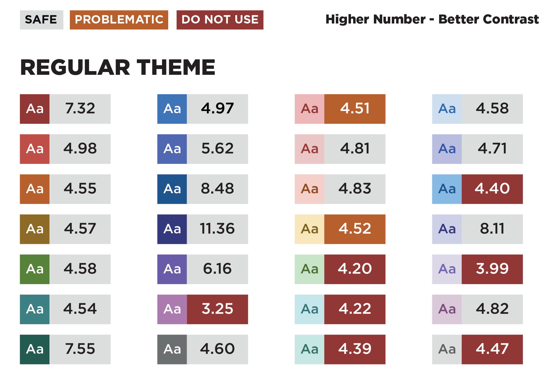
Contrast ration in Microsoft List Color selection
The ones with the orange label are too close to the 4.5 contrast ratio, and their monotonous nature could cause additional problems. So they could be problematic, for example, if you have a color weakness.
After checking the colors on a light theme, I also checked all list formatting color slots on a dark theme. Surprisingly the picture looks different there. On dark yellow and dark blue, we get completely different colors. All those are perfectly fine in the case of the contrast ratio.
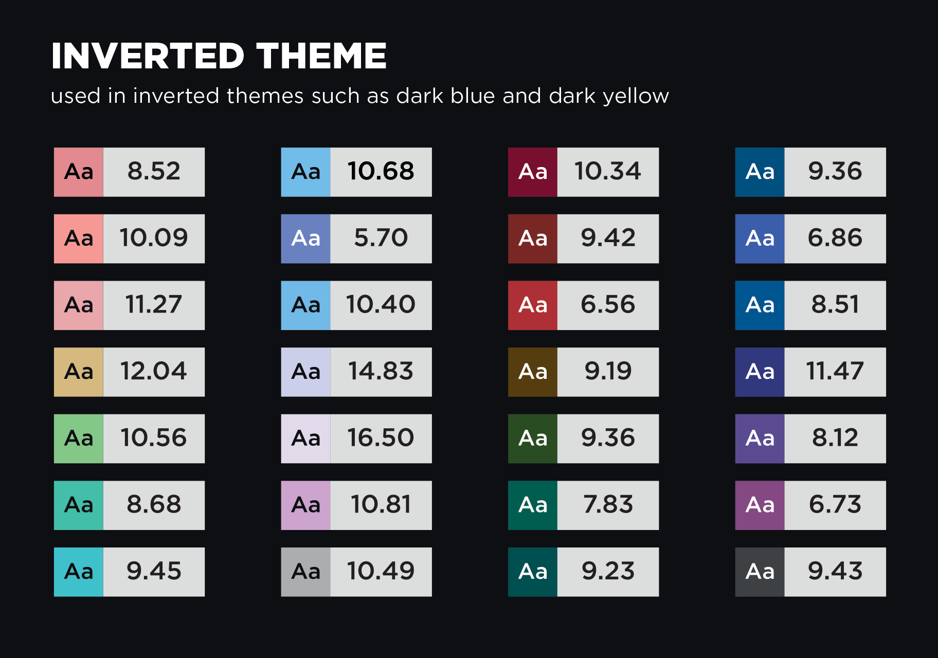
Inverted Theme Color slots
Nearly all the available slots surpass the enhanced contrast ratio, which has recommended 7:1 contrast ratio—they even meet the AAA rating.
Does this mean you should probably consider switching all your intranet to an inverted theme? Probably not, but I was surprised that there is such a huge difference there.
High Contrast Mode
One last thing I recognized during my testing was that none of the themes supported the Windows High Contrast mode. So if you are aware that you have to keep this mode, I wouldn’t use colors at all on the list.
High Contrast Color Slots do not show what could be expected.
I haven’t done a full assessment there, but the situation on high contrast does not match even the selection and the result you get.
Conclusion
If you need a chart showing you what contrast ratio is safer than others in the theme selector, I attached a PDF at the end of this blog post.
You can print it out, hang it on your pin wall or beside your display, and you will find the ratio and the safe colors at your disposal ever. Support as many people as possible in their experience with Microsoft lists in your organization.
Finally, the color picker would look with only accessible colors.
Accessible colors as presented in picker
Download “Microsoft List Formatting – Accessibility Chart – Cheat Sheet” as a PDF.