Besides all the JavaScript/TypeScript files, you will get CSS when you provision a new SharePoint Framework project. In this blog post, I try to explain just something simple. How to name your CSS files correctly and what difference your naming makes.

module.scss
If you create a “HelloWorld” web part, you will get a file for your CSS that contain two extensions. Modules and SCSS. Both extensions indicate which order the styles compile in your SharePoint Framework solution.
First, the file will be run through the SASS preprocessor and create an in-memory CSS file. Then it will be picked up by the compiled CSS and run through a tool called CSS Modules. CSS Modules ensure that all your written CSS code only applies to your SharePoint Framework component.
CSS Modules is also responsible for making your CSS “type-safe”. Error messages in the console like this are wrong.
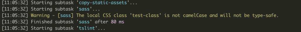
Type-safe error in SPFx
CSS Modules do not make your CSS type-safe because this construct does not exist. It helps developers to autocomplete class names in their TypeScript code and helps to keep all your style information in the context of your web part.
How the content of CSS transforms in the build chain
Let’s assume you have a style definition in SASS like this.
.testClass {
  content: "Hello world";
  background-color: red;

  &:hover {
    background-color: blue;
  }
}
SASS converts it into the following code:
.testClass {
    content: "Hello world";
    background-color: red
}

.testClass:hover {
    background-color: #00f
}
CSS Modules converts it into the following code:
.testClass_232598bb {
    content: "Hello world";
    background-color: red
}

.testClass_232598bb:hover {
    background-color: #00f
}
But it also creates the following JavaScript object, which allows you to use “style.testClass” in your TypeScript code.
/* tslint:disable */
require("./TeamTestExampleWebPart.module.css");
var styles = {
    'test-class': 'test-class_232598bb',
    testClass: 'testClass_232598bb',
};
export default styles;
/* tslint:enable */
//# sourceMappingURL=TeamTestExampleWebPart.module.scss.js.map
The random string added to your class name makes the styling scoped to your web part. As you see in the example above, using the styles like “styles[‘test-class’]” does not help your development but is also not wrong to write. It is more like SPFx or JavaScript does not support having a dash in the variable name.
Other remarks on CSS Modules
So CSS Modules do not make you CSS type-safe but makes it scoped to your web part only. Your web part might look strange but not the rest of the page.
So if the web part uses the extensions ‘.module.css’ CSS modules, create a random string and attach it to your web part style sheets. The appended arbitrary string is unique to your component, not your web part. This fact causes a lot of trouble through the ‘.modules.scss’ naming, but there are ways around it.
Assuming that your project has more than one component, every ‘module.scss’ file will create its own set of random numbers.
A typical project
Here is an example, and I have seen many developers do it this way. You have a project with sub-components, and all style sheets of those components have ‘.modules.scss’ and the end. It is not mandatory to use it this way, and I will explain a better way to do it later.
SharePoint Web Part project with one sub-component
The web part has its style sheet as well as the custom button.
TestwebpartReact.module.css
.testwebpartReact_03a125e2 {
}
CustomButton.module.css
.customButton_ab38bdcc {
}
The “TestwebpartReact” has the hash ’03a125e2′ appended on the style sheet classes while the “CustomButton” has the hash ‘ab38bdcc’ appended. In short, both serve not as parent and child but as separated components instead.
Here are some examples
For example, Media queries on a web part
Apply a media query on the main web part.
.testwebpartReact {
  overflow: hidden;
  padding: 1em;
  color: "[theme:bodyText, default: #323130]";
  color: var(--bodyText);

  @media screen and (max-with: 480px) {
    .customButton {
      background-color: black;
    }
  }
}
This to not result in an error but the compiled code looks like this:
.testwebpartReact_a1e8c0a9 {
    overflow: hidden;
    padding: 1em;
    color: "[theme:bodyText, default: #323130]";
    color: var(--bodyText)
}

@media screen and (max-with:480px) {
    .testwebpartReact_a1e8c0a9 .customButton_a1e8c0a9 {
        background-color: #000
    }
}
In your solution, there are no ‘.customButton_a1e8c0a9’ styles defined; there is only a ‘.customButton_ab38bdcc’ which will result that the media query won’t get applied.
On the other hand, when you try to add a media query that reflects the parent. The class ‘.testwebpartReact’ will get the wrong hash code too.
So with this setup, there is no way you will be able to apply proper media queries, nor does it allow code sharing between multiple web parts.
A more dramatic issue here, but what if you like to use the same components in multiple other containers with different media queries? You won’t be able to do it.
Naming Styles Sheets in SharePoint Framework
Here are two rules to keep your web part clean and a great developer experience.
- Main Component: ‘
.module.scss’ - Sub Components: ‘_
.scss’
Main Component:
We want to process the main fail through CSS modules because this way, we can make sure the web part has its scope styles. Therefore do not affect the rest of the page.
Sub Components:
Are named with an underscore and without ‘modules’ in its name. To use SASS partials.
Recipe for SharePoint Framework
Rename sub-component style sheets:
Renamed the sub-components style sheet from ‘CustomButton.module.scss’ to ‘_CustomButtons.scss’. This way, SharePoint Framework does not create its style sheet in the *lib* folder.
By renaming the files, you cannot use the styles in your sub-component anymore.
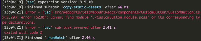
Error after renaming the file
Use the styles in the parent component
So on the web part, we have to go to the ‘modules.scss’ file and refer to the child component. There are two ways to do this:
/** Not recommended **/
@import './CustomButton/CustomButton';
The old import syntax is already marked to get deprecated at some point, but it imports all style definitions in the main web code. Check out the SASS document and heads up on this
/** Recommended **/
@use './CustomButton/CustomButton';
The current and future approach is to use ‘@use‘ and ‘@forward‘ instead of ‘@import’. There was always confusion with the ‘@import’ because it is also supported in CSS natively.
Reference the styles object of the parent component
In your child component, we have to reference the style object of the parent component or make ‘style’ sharable between the members.
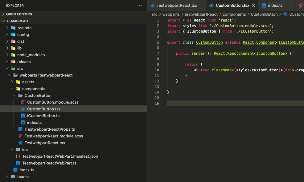
import styles from './CustomButton.module.scss';
So instead of using this, I changed it to reference the style object from the web part.
import styles from '../TestwebpartReact.module.scss';
So the sub-component now still can use ‘styles.*’.
export class CustomButton extends React.Component<ICustomButton, {}>{

    public render(): React.ReactElement<ICustomButton> {

        return (
            <button className={styles.customButton}>{this.props.label}</button>
        )
    }

}
This way, you will only have one stylesheet with one defined random CSS modules string. Here is the outline of the web parts CSS file.
/* File: _CustomButtons.scss - Custom button styles */
.customButton_cfc773fc {
}

.customButton_cfc773fc:hover {
}

.customButton_cfc773fc:active {
}

/* File: TestwebpartReact.module.scss css of web part main */
.testwebpartReact_cfc773fc {
}

/* including the media query that can be applied to the button */
@media screen and (max-with:480px) {
    .testwebpartReact_cfc773fc .customButton_cfc773fc {
    }
}
Now you can apply media queries and other common styles to all the components. You can even make your styling more context-driven, and you especially avoid unsafe constructs such as this:
.testwebpartReact {

    div[class*="customButton_cfc773fc"]{
      content: "my style overrides for a local component.
    }
}
There might also be better options that I am not aware of on passing a context style object to all children.
If you know a better method, please let me know.
To Summarise
A web part or any other extension in a SharePoint is an atomic component on the page. CSS Modules make this component safe so that no CSS bleed out into the page.
Since even sub-components are related to the main component, they should have one unique CSS Module postfix hash across all sub-level components.
Through CSS partials, the style information can stay with the sub-components for better organisation and get imported wherever needed.
Last but not least, name your component to find it easier in your global “yet local” style object.
CSS Modules do not make you CSS type-safe but help you bring convenient auto-completion to your code.
CSS has data types but none that TypeScript supports nor understands.