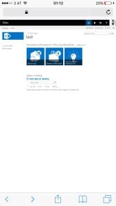
Many people recently discovered a new enhancement in Office 365 and especially SharePoint. The suite bar is now responsive if “First Release” option on your tenant is activated.
Responsive Office 365 suite bar rendered on mobile device
The first people that blogged about this responsive improvement were Wesley Hackett and Marc D. Anderson.
The current implementation works well on desktop but not on mobile devices.
Why it doesn’t make your Office 365 / SharePoint responsive?
Actually the current suite bar lacks of one important thing. The viewport meta tag is currently not implemented in SharePoint or Delve. This tag is responsible to render the page correctly. The display of modern devices has a higher pixel density than the normal desktop computer. The viewport meta tag helps the browser to scale web sites properly. Is this html tag missing in the header of the html document the website will be rendered as a desktop version, but everything is tiny and unreadable unless you pinch and zoom.
If you have a new Lumia 950 for example the pixel density is 314 pixels per inch. Desktop monitor in reality has pixel densities beyond 72 pixels per inch but thus the actual base size your browser renders the web site. All CSS values are calculated based on this.
On mobile devices without a proper viewport meta tag the web site will look like the desktop version, but really tiny and therefore unusable.
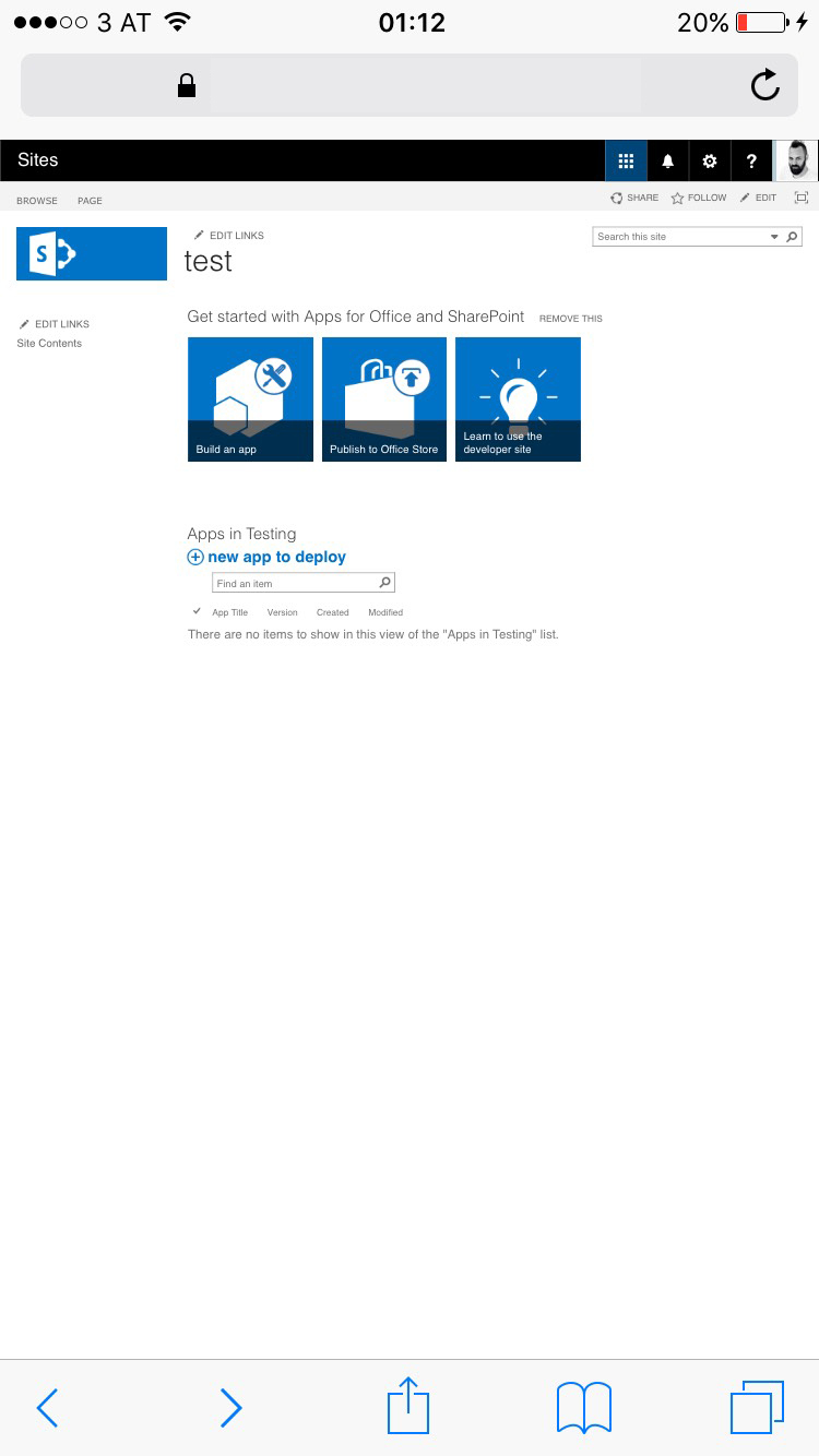
This brings us back to the new shiny responsive suite bar. A good example when a web site wasn’t tested on a real device. Works perfectly on a desktop browser but not on mobile. Someone might have forgotten to include the view port on the master page. On my phone, SharePoint will be rendered like this.
Suite bar rendered on mobile device
As mentioned earlier, it is currently only available for first release subscriptions. So currently nothing to worry about. I hope this will be fixed in the final release and we currently see an early beta version of the suite bar.
Where can the problem be spotted. Simply everywhere in Office 365. Here is a detailed list:
- Missing viewport meta tag
- With viewport but not responsive design
Outlook and Calendar use device detection. Some sort of Device channel to work responsive.
The only first an real native responsive apps are currently Sway and blog post on Delve. Both are equipped with a correct viewport.
Final thoughts
The new suite bar gives a nice outlook on coming up design features. I expect to see more improvement in the near future. Currently, SharePoint in Office 365 and SharePoint 2016 is built upon XHTML 1.0 and not HTML 5. Once the doctype have been converted an all functions work on HTML5 I guess we will see more adoptions to come out faster and more reliable.
From my perspective the new suite bar is a fast shot. I also have concerns about the usability. On mobile the waffle aka app launcher is hidden behind the three dots in the suite bar. To switch between SharePoint and Mail or Calendar users have to tap twice. This forces to learn user a new behavior because the app launcher was one of the essential improvements recently.
On the tablet devices the app launcher is jumping from left to right. This is actually a no-go. User will get confused. A small resize of the window is enough to show this effect. You don’t even have to be on a tablet device.
If you think about to change the master page of SharePoint to make this work. In Office 365 editing the master page is not recommended to do so. I guess this issue will be fixed by Microsoft sooner or later.
In case of a publishing page SEO meta tag injection can be use to add a proper meta tag. For a javascript based solution to add the viewport meta check out the solution provided on OfficeDev Pattern & Practices.
If you have other concerns, feel free to comment on this blog post.