Recently two changes have been shipped with the latest browsers versions that impact your development today too. In short, you can now better define the loading behaviour for images. It’s big news in case of performance and usability. Those changes are:
- Always use height and width on images
- Natively Lazy-load images and iframes
Why height and width on images
Let’s say when you have am image with a defined height and width defined so your style guide might define several variants for pictures used on SharePoint, Teams, any other web site or application. You might have set those expect ratios are 16:9, 4:3, or anything another suitable aspect ratio.
The latest browser versions now calculate the aspect ration for images based on the height and width values placed as attributes on the image. For example, your image is defined by width=1600px and height=900px this gives you an aspect-ration of 16:9.
<br /><img src='yourimage' height="900px" width="1600px">
The container that should render the image has a width of 1024 pixels. The browser finds the image know height and width and estimate based on the relation of both values how high the image would be. In this particular case, it reserves a space for the picture of 1024 pixels width and a height of 576 pixels.
Older browsers or visual elements without any specified height and width load the page like this:

Regular loading behaviour without aspect ration
The black border around the images or in this case lines will be shown to the user first. So the browser is unable to reserve the appropriate height and shows all images collapsed.

Full loaded page push paragraphs down
Once the images are loaded the paragraph after time image will be pushed down. The more pictures you have, the more this “jumping around” and repositioning of elements happens which forces the user to wait until all the content is loaded.
Besides the image has the following CSS define to make it responsive at all.
.rwdImage{
    width: 100%;
    height: auto;
}
If the browser can identify the aspect-ratio by its height and width, the latest browser versions load the image like this.

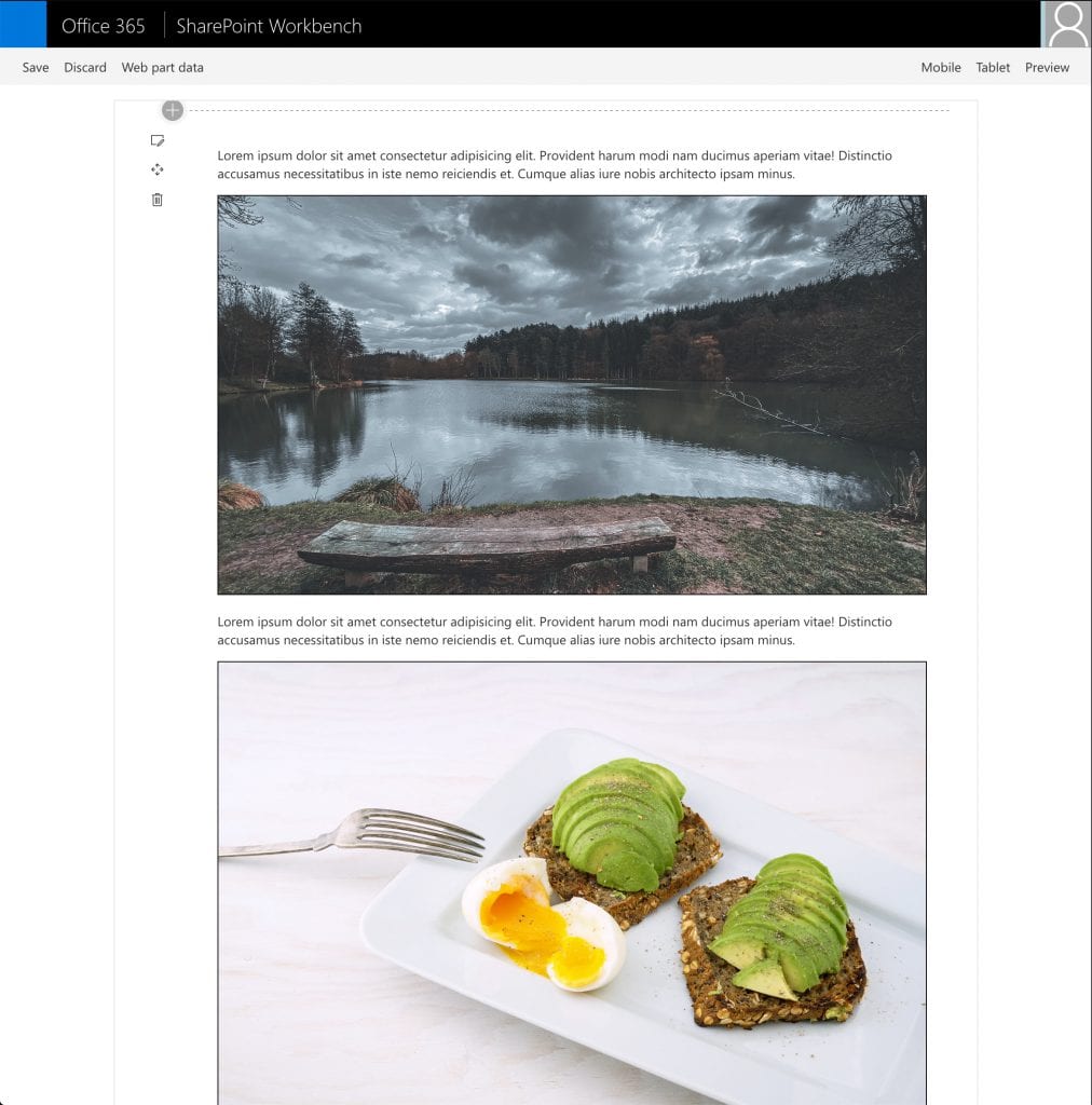
with height and width the browser was able to identify the aspect ration
The overall loading behaviour changes dramatically, right after loading the DOM in your web part or on your page.
The images on the page already have reserved space with an aspect ratio of 16:9. The second paragraph is in the final position, and the user only has to wait until the images loads to see the content of the image. Other than the previous example, the content does not jump around.
Instead, all content stays in the same place all the time.

Browser loads the image in the pre-defined container with the precise aspect ratio
The first time I learned about this handy UX improvement was by Jen Simmons on the Mozilla Developer channel. She explains this improvement more in-depth. I recommend to check this out.
Legacy browsers such as IE11 and those who don’t support this feature yet don’t experience any negative impact, and the CSS always overrules the image attributes. Your code even gets ready for the future and helps you with smaller images too.
With that said. Put back in height and width attributes on your images and icons. Chrome / Edge 80 and the latest Firefox version support this aspect ratio for images already.
Lazy loading images and iframes
The second thing that landed in Chrome and Edge 79 (current version 80 by time writing) is the new HTML standard attribute for ‘loading‘.
This new attribute on images or iframes can have one of the following two values:
- lazy
- eager
The value applied to an image looks like this:
<img src="https://myurl" loading="lazy" height="1600" width="900">
Again we use the aspect ratio from the previous example. The browser now loads all images visible on the page first and post-pone all images not displayed in the unvisible parts of the page.
When the user then scrolls to those images, those will be loaded. In other words, it reduces the network traffic on the first load and allows the page to render faster. Allows faster page loads in general and therefore lead to an improved user experience a lot.
IE11 and browser that do not support this new web standard yet will ignore the attribute as with all things they are not aware. You can use this value to implement a polyfill based on this attribute for legacy support, for example.
There is also a great more in-depth article on web.dev around native lazy loading.
Last words
With all that said, both additions for images won’t hurt legacy browsers but are beneficial for the current browser and the user experience.
There is no need to post-pone these additions to your code until 99.9% of the browser support it.
So the benefits outweigh the negative ones. Use it, whatever you develop from now one.
My next speaking Session on things like this and many more I speak at this years SharePoint Conference from 19th – 21th May in Las Vegas. Save 50$ and register using the BAUER on the registration form.

Hello Stefan,
It appears that when using this technique with lazy loading enabled on Chrome, the image placeholder shown before loading will have a square aspect ratio. Without
loading="lazy", the placeholder has the correct aspect ratio, but with it, it becomes square. Do you have a solution to this problem? Is it a bug in Chrome?I described it in more detail here: https://stackoverflow.com/questions/61027060/maintain-aspect-ratio-of-images-in-chrome-during-native-lazy-loading
The aspect ratio just has been recently introduced in Chrome and Edge. You might have still an outdated version maybe.
There is also. some guidance on Chrome Web Developer Portal https://developers.google.com/web/tools/lighthouse/audits/aspect-ratio or MDN – https://developer.mozilla.org/en-US/docs/Web/Media/images/aspect_ratio_mapping
Thanks for the response. I have Chrome 80, which is the latest stable version. Just to be clear, are you saying that you do not see the issue with a newer Chrome version (perhaps with the beta)? (EDIT: It’s the same with the beta.)
I tested it with simple layouts in Chrome, Edge and Firefox and haven’t experienced the same problem you have. There might be some issue when the previous container couldn’t be properly detected maybe but I so far haven’t had any problem rewriting older code to use this method.
It’s a bug in Chrome. See the link I added to me SO post.
Looks like this bug still hasn’t been fixed with Chrome 85 because I’m having the very same issue.
Aspect ratio of the image is preserved in Firefox but not in Chrome before the lazy loading takes place which ends up with layout shifting when the image actually loads.