TLDR: Thanks to SharePoint, it is possible to write an Office UI Fabric styled button without using ReactJS or Office UI Fabric at all. The code is simple and easy to reproduce for any project. Copy the source this blog post contains and you are ready to go.
Create an Office UI Fabric button wihtout Office UI Fabric
The longer story is that recently, more theme slots are available in SharePoint Online than before. I created a reference chart for the documentation of SPFx-uifabric-theme project.
So isn’t it exciting to create buttons, hyperlinks and input fields just using SASS variables and fundamental HTML elements?
I primarily use SPFx-uifabric-theme to demo how this works, but the following source code also contains the Microsoft SASS variables.
The basic button
First, we create the default buttons using these theme slots.
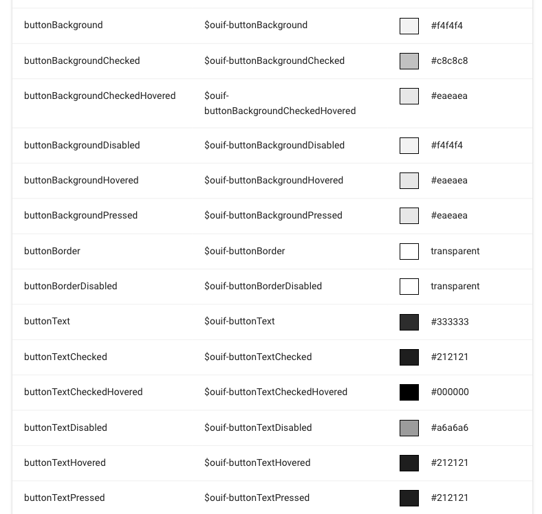
Theme Slots available in the engine
So whenever you want these theme slots on a button element. Just define a style sheet class that references the theme slots.
// Import SPFx-uifabric-themes
@import "./node_modules/spfx-uifabric-themes/ouif.theme";

// web part container class
.simpleOfficeUiFabricButton {

  // Office UI Fabric button
  .ouifButton {

    // font size and wight used by the OUIF buttons
    font-size: 14px;
    font-weight: 600;

    // Box sizing of the Office UI Fabric Buttons
    height: 32px;
    padding-right: 20px;
    padding-left: 20px;

    // Text color, background and borders
    color: $ouif-buttonText; // Theme Slot: buttonText
    border: 1px $ouif-buttonBorder solid; // Theme Slot: buttonBorder
    border-radius: 2px;
    background-color: $ouif-buttonBackground; // Theme Slot: buttonBackground

    // Hovered state using the theme slots
    &:hover {
      color: $ouif-buttonTextHovered;
      background-color: $ouif-buttonBackgroundHovered;
    }

    // Active state using the theme slots
    &:active {
      color: $ouif-buttonTextPressed;
      background-color: $ouif-buttonBackgroundPressed;
    }

    // Disable state using the theme slots
    &:disabled {
      border: 1px $ouif-buttonBorderDisabled solid;
      background-color: $ouif-buttonBackgroundDisabled;
    }
  }
The first import is a reference to the spfx-uifabric-themes project I installed in the dev dependencies in the package.json. The style sheet class I applied on the button I named .ouifButton you can name it however you like.
The rest of the style sheet here is just using theming slots provided by the SharePoint theming engine. Even state styles such as hover, active or disabled are available.
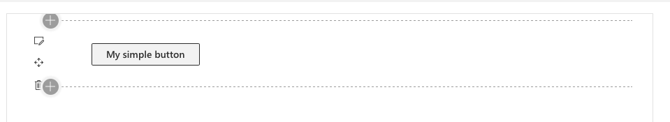
The HTML I used to test is just a surrounding div container and a standard HTML button.
  public render(): void {
    this.domElement.innerHTML = `<div class="${styles.simpleOfficeUiFabricButton}">
        <button class="${ styles.ouifButton }">My simple button</button>
    </div>
    `;
  }
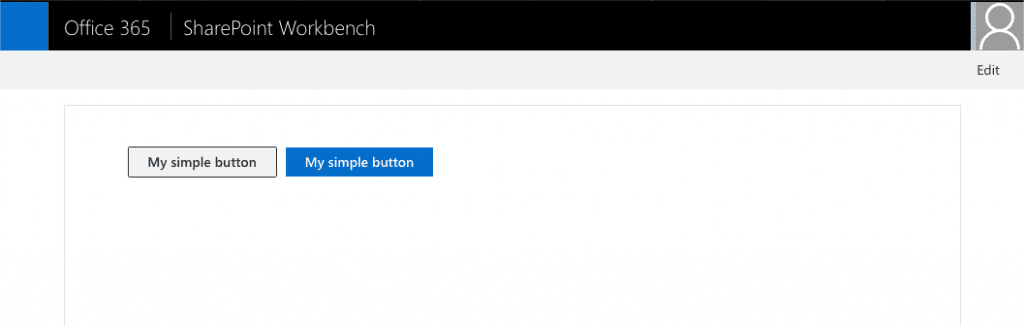
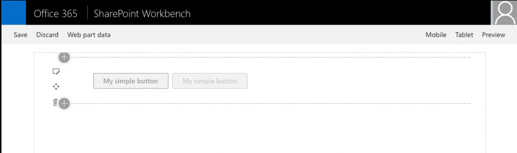
The resulting button is the same as an Office UI Fabric button. I optimised the button a bit to include only the required CSS definitions. I recognised that there is a little bit of clutter in the React components.
Office UI Fabric looking button
The compiles CSS looks has not all the theme slot strings included.
.simpleOfficeUiFabricButton_69a91d0e .ouifButton_69a91d0e {
  font-size: 14px;
  font-weight: 600;
  height: 32px;
  padding-right: 20px;
  padding-left: 20px;
  color: "[theme:buttonText, default:#333333]";
  border: 1px "[theme:buttonBorder, default:transparent]"solid;
  border-radius: 2px;
  background-color: "[theme:buttonBackground, default:#f4f4f4]"
}

.simpleOfficeUiFabricButton_69a91d0e .ouifButton_69a91d0e:hover {
  color: "[theme:buttonTextHovered, default:#212121]";
  background-color: "[theme:buttonBackgroundHovered, default:#eaeaea]"
}

.simpleOfficeUiFabricButton_69a91d0e .ouifButton_69a91d0e:active {
  color: "[theme:buttonTextPressed, default:#212121]";
  background-color: "[theme:buttonBackgroundPressed, default:#eaeaea]"
}

.simpleOfficeUiFabricButton_69a91d0e .ouifButton_69a91d0e:disabled {
  border: 1px "[theme:buttonBorderDisabled, default:transparent]"solid;
  background-color: "[theme:buttonBackgroundDisabled, default:#f4f4f4]"
}
Everything is ready for theming on the SharePoint pages. Cool right? Wait, there is more.
The primary button
Whenever you see a button that has a background like the primary theme colour, it is the so-called primary button. The styles for this button follow the same pattern as the default button. It just used different theme slots.
  .ouifButtonPrimary {

      // extend all other settings from the previously defined .ouifButton
    @extend .ouifButton;

    color: $ouif-primaryButtonText;
    border: 1px $ouif-primaryButtonBackground solid;
    background-color: $ouif-primaryButtonBackground;

    &:hover {
      color: $ouif-buttonTextHovered;
      border: 1px $ouif-buttonBackgroundHovered solid;
      background-color: $ouif-buttonBackgroundHovered;
    }

    &:active {
      color: $ouif-buttonTextPressed;
      border: 1px $ouif-primaryButtonBackgroundHovered solid;
      background-color: $ouif-buttonBackgroundPressed;
    }

    &:disabled {
      color: $ouif-buttonTextDisabled;
      border: 1px $ouif-buttonBorderDisabled solid;
      background-color: $ouif-buttonBackgroundDisabled;
    }
  }
Instead of writing all the base styles again, SASS has something smart included. It allows you to extend new classes based on existing. It also detects the attributes both have in common and what differentiates them and optimises the CSS output. It has a pretty smart algorithm behind.
The rest is just prefixing the SASS variables for ‘button…’ with ‘primaryButton…’. That is all the magic.
The result is a blue button and the same behaviour as the Office UI Fabric buttons.
Office UI Fabric Primary Button
So even disabling button styles works perfectly.
Office UI Fabric disabled style
The rainbow test
All the previous screenshots came from the local workbench. Let’s try some real-world theming on the Office 365 workbench.
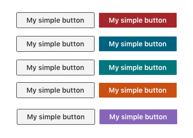
A simple HTML Button with different themes
Overall thanks to the updated theming available now in SharePoint it is easy to recreate styles for Office UI Fabric in any framework.
Verdict
The revamped theming engine in SharePoint Online is pretty amazing. In the case of colour options and theme slots, we have nowadays more options than in the past.
There is no need to go with Office UI Fabric and create a consistent user experience in the overall SharePoint setup. Also, the theming engine allows you now to create your own custom experiences.
You can use even use the Microsoft SASS variables, but therefor you need to install Office UI Fabric React. Besides, you have to add a reference to the following file in your SASS file.
@import '~office-ui-fabric-react/dist/sass/themeOverrides.scss';
There is no documentation yet available. The SASS variables are easy to find in the themeOverrides.scss.
The theming engine and a look in the future of Office UI Fabric
Honestly using this theming engine built into SharePoint is more efficient than using Office UI Fabric. It gives you more development possibilities and flexibilities. Yes, this example shows just a simple button, but it is just the tip of the iceberg. There are much more possibilities by mastering theming.
Kudos to the team behind SharePoint engineering. The updated theming engine is a significant step forward.
In the case of Office UI Fabric, there are still many gaps and issues related to it. One, in particular, is that it is still yet ReactJS only. From a Microsoft perspective, it makes sense, cause it is their weapon of choice.
Another issue is that in my opinion, it is to heavy and not atomic enough to be useful. This fact leads that using the options through theming and apply styles to custom component make more sense.
When I look into the future, we hopefully see an HTML/CSS based and more fine-grained implementation of Microsofts Fluent Design system. A version meant to reach a broader implementation platform and not ReactJS only. Especially not only exclusively to Office 365 but also useful for standalone applications attached to Office 365.
It is a long way to go to become the next Material Design.
What do you think? Do you take a closer look into the Office 365 theming engine? Will you make use of the styles for custom handcrafted components?
I am interested to hear your opinion!