Recently Waldek Mastykarz (@waldekm) and I developed a sample for the Office Pattern and Practices. This sample query contact information by using the Microsoft Graph. We also optimism the user interface for mobile use.
While Waldek took care of the technical development of this sample I was responsible for the user experience and user interface design.
Make SharePoint SASSy – Webinar recording now online
Today I had the great pleasure to record a webinar for SharePoint Europe. Actually, it was not a new session, it more hat the purpose to show people how I develop now in SharePoint. Especially how my branding workflow nowadays looks like. I use now SASS for all my branding in SharePoint, because it has a lot of benefits in manner of consistency, reusability and fundability of CSS changes and adoption.[Read more]
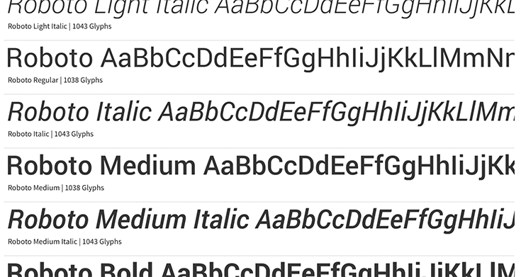
Things you should know about web fonts and font packages
During the last years I’ve intensively used web fonts. Since I published the first blog post on how you use web fonts in SharePoint 2010.
While I just downloaded the web fonts and used the CSS that was included in the font packages I recognized more and more that most of the available web fonts are wrong defined inside the font packages. There are a couple of problems with the definitions of the @fontface that you can avoid creating a cleaner style sheet.
Office 365 Icon font documentation
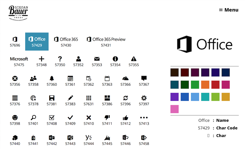
I’m not quite sure when it happened. During the last twosome of months, Microsoft provides some icon fonts in Office 365.Especially the newly introduced app launcher makes use of icons of this typeface.The content varies from icons, such as the Hamburger menu, arrows, general, UI elements, as considerably as all Microsoft Applications. The files of this font are hosted on the Microsoft CDN so they are ready to use to spice up Apps.
Why to use icon fonts?
Icon fonts provide a couple of benefits. Fonts are scaled better than any image across different screen resolutions and even looks great on high density displays without any loss of quality.
There is another advantage to use this font. By using the same icons as in Office 365 you will be able to provide a consistent user experience.
Microsoft created a while ago some UX Guidelines for Apps in SharePoint, but you won’t find any information on the icons.
How to get access to the icon font of Office 365?
As mentioned earlier CDN is the key. Microsoft provides some centralized assets there. There is only one problem the use of a CDN is mostly undocumented. One general documentation can be found on the MS Technet.
There are several CDN endpoints and in case of SharePoint only one url exist in Office 365 for a long time. This URL is //cdn.sharepointonline.com. This url can be accessed via http (port 80) and http’s (port 443).
To make use of the icon font the following code needs to be used in your courses.
@font-face {
    font-family: "SPO365Icons";
    src: url("//cdn.sharepointonline.com/14025/_layouts/15/fonts/Office365Icons.eot");
    src: url("//cdn.sharepointonline.com/14025/_layouts/15/fonts/Office365Icons.eot?#iefix") format("embedded-opentype"),
         url("//cdn.sharepointonline.com/14025/_layouts/15/fonts/Office365Icons.woff") format("woff"),
         url("//cdn.sharepointonline.com/14025/_layouts/15/fonts/Office365Icons.ttf") format("truetype"),
         url("//cdn.sharepointonline.com/14025/_layouts/15/fonts/Office365Icons.svg#web") format("svg");
    font-style: normal;
    font-weight: normal;
}
You might recognise the path in there that points to “_layout/15 “ which is the current version of SharePoint. The path before the layouts fairly undocumented and might change over time. I try to maintain those urls in future until there is an official documentation available.
Content of the icon font
The font-face definition can be added to the custom style sheet of your app. Again the content of this font is undocumented as well.
This was the reason why I set up a small interactive documentation that use the CDN urls and shows all relevant icons. So you don’t have to search all the 65536 glyphs (or characters).
The guide be found on my newly created lab site under the url lab.n8d.at.
A page that I’m looking forward to maintain in the future and add some additional information and things there.
Following the principles of “Ship or die”. The mobile support is currently beta too. I’m looking forward to provide a superb user experience.
If you have any comment, suggestion how to improve. Please feel free to comment. I will be lucky to hear from you.
Typography First – Make your SharePoint content readable and compelling
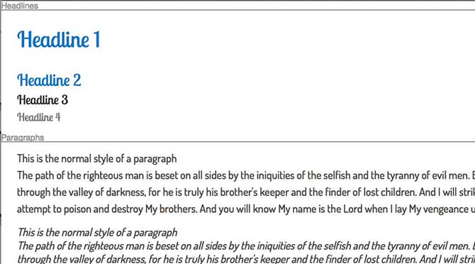
The first thing when I start a new branding project I first make myself familiar with the fonts I want to use. This is because I want to see how they work on some basic text elements an if the text is readable.
In general the overall typography is the most important factor to success of any information system or web site. 90% to 95 % on a website is dominated by text. Becoming a master on typography means you become a better web designer or SharePoint brander, but it is no easy topic and I just want to scratch the surface here but provide some good links for further information at the end.
The basic
The typography setup can be mainly defined by the following factors:
- The Font
- Font Size
- Font Weight
- Line Height
- Letter Spacing
In other words, these are our core ingredients how we can manipulate the text. For example, some fonts look great with the predefined letter spacings while others require a little bit more space in between the characters. You can also use the letter spacing to make a special effect on headlines. For some examples that a look at Helvetica, Bold, Big, Negative Letter-Spacing.
How many fonts should I use?
In general when, you plan a design it is common practice that you don’t use more than three to four different fonts. Those different fonts can be defined for:
- Headline (<h1>-<h6>)
- Paragraphs (<p>)
- Quotes (<cite><cite>, <block quote> is decrepted with HTML 5)
- Code, Navigation,…
When we take a look at the out of the box design of SharePoint 2013 at least 3 different fonts was used. Those fonts are Segoe UI (for smaller text), Segoe UI Light (for large text such as headlines) and Segoe UI Semilight (<h2>-<h3>).
The fonts are part of the same font family, but have a different font weight, which is indicated by “Light” and “Semilight” and those fonts are slightly different. The typeface was adapted to the weight and are not only bold and “not so bold”. The reason why Microsoft used those different font faces was that they look great in there specific use case. Improved the readability and the overall design.
When a theme is used in SharePoint the fonts can be changed to only a maximum of two fonts. Mostly Segoe is used for the regular text as used in a paragraph, navigation, and so on because of its good readability. The larger font in the font picker will be applied to the headlines only.
Reset and Reapply fonts using CSS
When a web design is created from scratch it is fairly simple to reset the fonts. All that needs to be done is to apply a base font to the body tag and additional fonts for the headlines.
@import url(http://fonts.googleapis.com/css?family=Dosis:500);
@import url(http://fonts.googleapis.com/css?family=Lobster+Two);
body{
    font-family: 'Dosis';
}
h1, h2, h3, h4{
    font-family: 'Lobster Two';
}
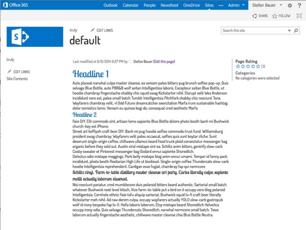
In SharePoint this only partially works because some elements will still have the Segoe font applied. For a full change of the body font some additional classes need to be added.
@import url(http://fonts.googleapis.com/css?family=Dosis:500);
@import url(http://fonts.googleapis.com/css?family=Lobster+Two);


body, .js-callout-body, .ms-calloutLink:link, .ms-calloutLinkDisabled, .ms-commandLink, .ms-commandLink:visited,
.ms-core-defaultFont, .ms-core-listMenu-heading, .ms-core-listMenu-heading, .ms-tv-header, .ms-core-listMenu-verticalBox > .ms-core-listMenu-root > li > .ms-core-listMenu-item, .ms-core-listMenu-verticalBox > .ms-core-listMenu-root > li > .ms-core-listMenuEdit, .ms-core-navigation, .ms-core-pageTitle, .ms-core-pageTitle, .ms-core-pageTitle a, .ms-descriptiontext, .ms-metadata, .ms-secondaryCommandLink, .ms-secondaryCommandLink:visited, .ms-status-msg, .ms-textLarge, .ms-textXLarge, .ms-textXLarge, body, .ms-tv-header, .ms-webpart-titleText > a, .ms-webpart-titleText.ms-webpart-titleText, .o365cs-nav-header .o365cs-nav-navIcon .o365cs-nav-header .o365cs-nav-navIcon, body, .o365cs-nav-header .o365cs-nav-navItem, #pageStatusBar, a.ms-calloutLink:visited{
    font-family: 'Dosis';
}
h1, h2, h3, h4{
    font-family: 'Lobster Two';
}
So we now have two different styles that need to be applied differently to the Apps (first snippet) and SharePoint (second snippet). Both are probably stored in different style sheet files and we still don’t have any additional properties such as line height, font size or font weight applied to the fonts.
Finally and whats next
The two different style definitions cry for something more flexible and yes we can do this in SASS. By assigning variables we will be able to define the typography as global settings that are easy to change. Then we don’t have to care or worry about those style sheet classes.
In the meantime, you can do a test run and add the SharePoint Style Sheet from this blog post to your master page. If you want to get a little bit deeper into typography you can read the following resources.
Other articles in this series
Further readings
The future of SharePoint Branding
You cannot take a look in the future if you don’t know about your past. I started branding SharePoint in 2004. At that time I already had some years experience on developing web sites and application. Now we have 2014 and the SharePoint branding haven’t changed a lot. We still try to figure out how Microsoft built up the master pages and how we can bring them into a new form.
In SharePoint 2013 a great step forward has been made by Microsoft to improve the underlying style sheets and HTML. Tools like Twitter’s Bootstrap or Foundations and a couple of other frameworks have approach to bring responsive web design to SharePoint. Needless to say with all the benefits and downsides.

Global Experience Language by BBC
In the future we will see more and more applications (okay, okay apps) that will be integrated into our SharePoint.
Sooner or later our SharePoint will look like a patchwork of different designs. Will the future be of not branding SharePoint and use it as it is? I don’t think so we just need to find a smart way to adapt SharePoint to our visual needs and sometimes improved user experience for custom development inside the boundaries of the platform. Last but not least, how can we implement methods that helps us to adapt faster to future releases without recreating the branding from scratch as we did in the last versions.
CSS, FrameWorks, Themes
Currently, some branding like to do it the old fashioned way, just using the HTML and CSS to build up the user experience. Others prefer to use a framework and some might like to use the theming engine of SharePoint to change the look and feel.
There is no right or wrong with all these approaches. Over the last months I always asked myself the same question over and over again.
What can we do to create a smarter, better documented and future prover system than we do it today. Especially with Office 365, apps, display templates and much more everything become fluid. What worked today can be could be changed tomorrow.
For me the challenges of the future are focusing on content that lives throughout the different devices (Content Strategy). The usability that users expect on different devices. Last but not least we will see more and more different interfaces, there that access our content. May it be directly inside of an Office Application, a refrigerator, in our car or use a Xbox to manage a project.
We need to step one step back to see the bigger picture.
Design with a system
Wouldn’t it be great to have one central design system that handles all the different display forms without rewriting the code from scratch. Provide the same look and feel even user experience in SharePoint to Apps and even Office Apps. I think the key to success can be found in two concepts that are state of the art in web design today.
Design Systems
A lot of great information on design systems can be found on the web. The Laura Kalbag such system as:
“A visual design system is built out of the core components of typography, layout, shape or form, and colour.”
Another great explanation can be found in the article “Design Systems: Building for the Future”. Especially because he explains why design systems are more future proven than to use a framework in the context of a CMS.
The most inspiring article on this topic I found in a blog post called “Atomic Design” by Brad Frost. In his article he explained how to form a well structured and categorised design system for the future. He further explain how we can set up the core components (Atoms) that will be used to formulate larger components (from Molecules to Organism) that up into templates and pages. A functional demo of be found at patternlab.io
To me setting up such system has the following three benefits:
- Better documentation of what we didIf no design system has been set in place prior the concrete implementation it will be hard to find the components that have been implemented. The consequence of this is that we might end up with code that does similar stuff, but with different classes attached.
- MaintainabilityMost of the core components in HTML haven’t changed over decades, we just got some new. We can combine those in many different ways. The better we structure those the more maintainable the final branding will and easier to change in the future.
- TestablityIf we know how our components look and behave in different view ports, we better understand how they function and work in the overall design. Testing smaller components is much easier to accomplish.
DRY – Don’t repeat yourself
SASS and LESS are great CSS preprocessors that allow us to write much cleaner code. Hence we can build our rich text editor styles by changing and assigning some variables instead of writing those style definitions from scratch. I know this is just a simple example, but the benefit of these technologies is that is also removes some complexity and gives us tools that are much easier to use.
Another benefit is that especially SASS allows to compile different CSS files based on the same code. For example, you create one in the context of SharePoint and one for a SharePoint Apps.
If you cannot wait for my next blog post. I can only recommend to read the blog post about DRY-ing Out Your Sass Mixins.
Finally and whats next
Those theories sound nice I know but how can we get started. I tried some things out over the last weeks and I will publish my findings over the next weeks. So stay tuned.
If I’m not completely wrong some people struggle with the implement a corporate wide branding. Though the changes in the app model we are not in the “SharePoint Exclusive Club” anymore. Sooner or later we need to move forward and take a closer look what other web developer do and what they are struggling with.
As Jeremy Thake said at the SharePoint Conference in Barcelona there are many of web developer out there that will be sooner or later able to build up Office Apps and SharePoint Apps.
If you like to follow my journey I would be pleased. Have comments on this, please feel free to comment. I hope at least for some it will be an interesting journey to the future of SharePoint Branding.
Other articles in this series
Typography First – Make your SharePoint content readable and compelling
Responsive vs. Adaptive Web Design – What about Device Channels?
Three years after responsive web design was introduced by the “A list apart” – article – “Responsive Web Design” by Ethan Macotte. The reason why people love this is because it can be easily implemented. You just need to have a browser that supports CSS3 and HTML and you are ready to go. Is it really like this?
Currently web design is in a state that we code against the gray. We don’t know the devices that might access our web site. A resolution of a screen doesn’t give any information about the device.
This is the main problem from my point of view. We care too much about device resolution but neither the user nor the context the device is being used. Using a tablet – the user might want to have the same user experience as reading a book or magazine. Using a phone – the user might in a hurry and just want to get a brief introduction to read on a tablet or desktop later on.
In the following presentation I try to sum up Responsive and Adaptive Web Design and what SharePoint 2013 has to offer to connect the users, their context and the content.
The truth is that the consumer of your content doesn’t care if something is done on the server or on their client as long as they feel comfortable with the content and their context.
I held this presentation during ShareCamp Vienna (7.9.2013). Special thanks to organize this event: Thorsten Hans, Christian Glessner, Martina Grom, Toni Pohl, Hans Bender and everyone else who was involved in the organization of this event.
Finally I want to thank Brad Frost for the ongoing inspiration and lending me some slides.
Additional feedback on this presentation can be found on SPYam.
Feedback is always welcome.
