Its been a while since the last release for my toolset for Theming in SharePoint development. I work on a product, and I have to make sure that the web part design is flexible enough to work great with any SharePoint applied theme. I discovered many changes in the currently available theme slots.
The support in case of SASS variables in your standard SharePoint project is limited. It was time to update my tool, but it comes with more great features that only SASS variables.
SASS Variables in SPFx vs SPFx-ui-fabric-theme
In any SASS file in your web part projects, you see an import statement on the first line.
@import '~@microsoft/sp-office-ui-fabric-core/dist/sass/SPFabricCore.scss';
This import allows you to apply the primary theme colour on a custom button like this.
.button{
background-color: $ms-color-themePrimary;
border-color: $ms-color-themePrimary;
color: $ms-white;
}
It works entirely, but there is no possibility to apply additional hover state on those buttons. Well, it is possible but complicated and needs to get figured out first.
If you add SPFx-uifabric-themess to your project, you can use the available theme slots more skillfully. Any SharePoint theme has a hidden and undocumented slot for this example.
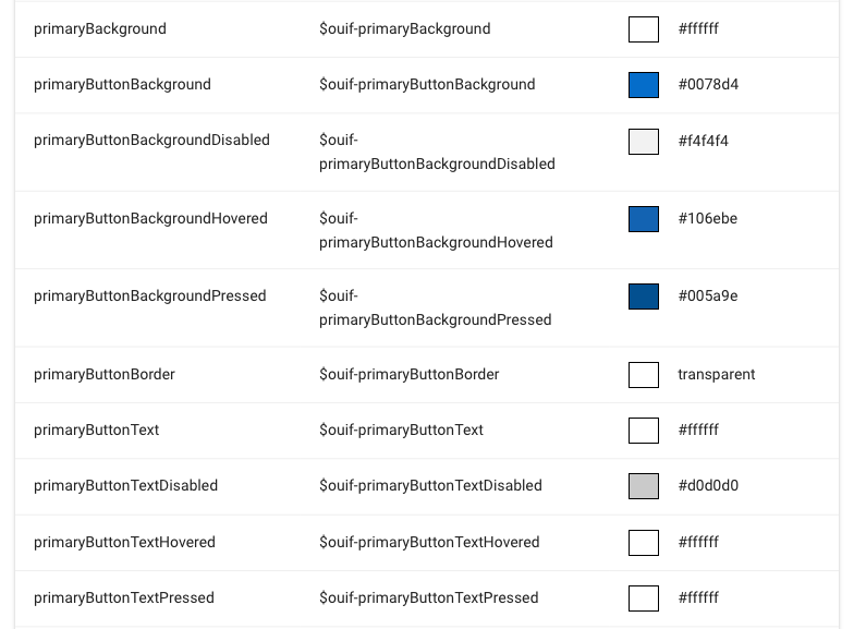
Extract of Primary buttons SASS Variable documentation
This screenshot of the SPFx-uifabric-themess documentation shows available SASS variable for buttons.
So you can use it in your code like this.
.button{
  background-color: $ouif-primaryButtonBackground;
  color: $ouif-primaryButtonText;
  &:hover{
    background-color: $ouif-primaryButtonBackgroundHovered;
    color: $ouif-primaryButtonTextHovered;
  }
}
There is more to discover because hyperlinks, different button styles, background and the primary text colour is available as SASS variables too. All in all, there are now 236 SASS variables out of the theme slots available.
CSS Variables
You don’t have to worry about IE11 anymore or like to get the theme colours as CSS variables. This feature has been updated too and supports now all theme slots (All 236 CSS Variables again).
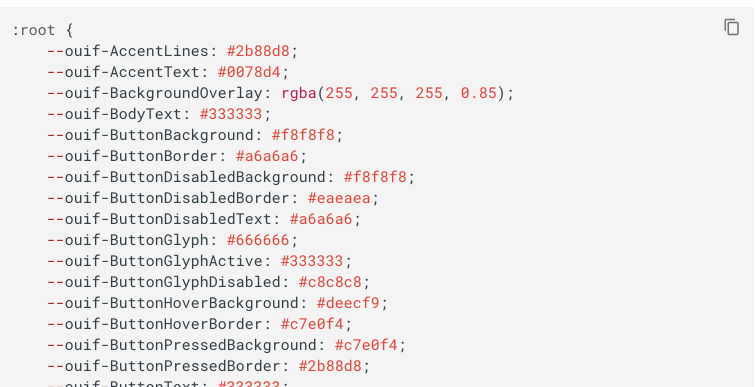
Extract of CSS Variable documention
The theme slots are stored in the __themeState__ object on any SharePoint Online page. So again you can use it for general text and background but also for states on buttons, links and many other scenarios more.
Check out the documentation on how to enable and use it.
One side note here. In general everything in CSS is case sensitive. The theme slots are stored in JavaScript, and the properties use camel-case. With SPFx-uifabric-themess, you can neglect this case sensitivity all CSS variables are available in camel-case as well as lowercase.
TypeScript definition for themeState object.
This version also includes the TypeScript type definition for the theme slot object. If you make use of it, you get syntax highlighting and type check when you address the theme slot directly.
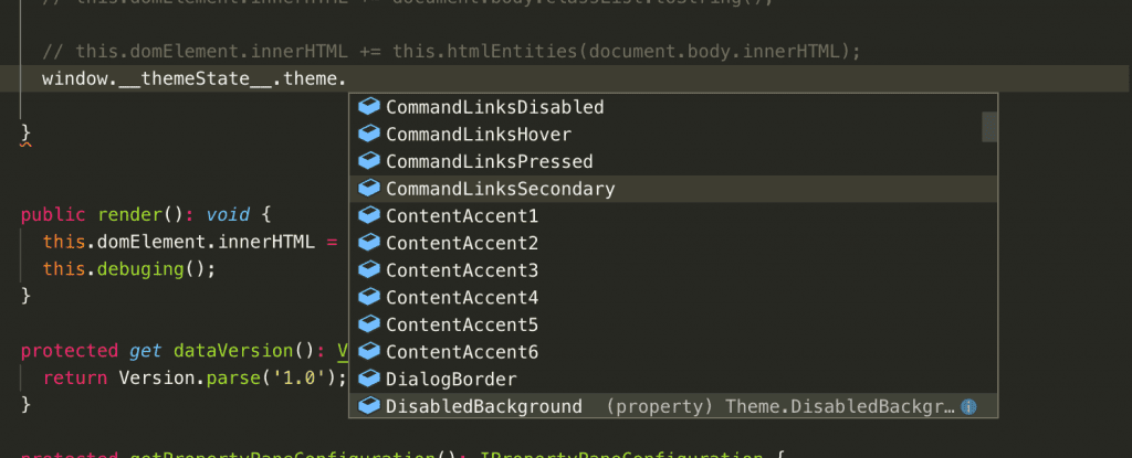
Intelisense in VSCode for __themeState__ object
There is also now a dedicated documentation page available. To make updates easy, I implemented a tool that directly converts any future change in a new type definition.
Future updates
I expect with these changes that my toolkit implementation needs to be updated more regularly and address changes in these APIs. There are also some ideas I have to make working with the SASS and CSS variables more comfortable.
This release is named ‘AliceBlue’. It is a name out of the CSS specification and the first one in alphabetical order. So there are plenty of names for upcoming releases.
The next pnp/SPFx generator will list this tool as a dependency that can be installed on any new project.
More links with informations:
- NPM: SPFx-uifabric-themes
- GitHub: SPFx-uifabric-themes
- Documentation