Last weekend I had the opportunity to speak at SharePoint Saturday Helsinki organised by Jussi Roine and Jussi Mori. With more than 170 attendees and 20 speakers, it was the best place to be in Helsinki on this Saturday.
While I was checking my demos for my session, I recognised a problem that currently exists on the Online Workbench for SPFx. The demo based on my blog post on how to make your web parts responsive to the parent container. In this blog post, I make use of the Office UI Fabric grid system class names and colour the content of the web part differently according to the parent container. A method beneficial to support the responsive flow of web parts and to improve the user experience.
I merely copied the working code from my blog post to a new SharePoint web part solution and ended up with the following result.
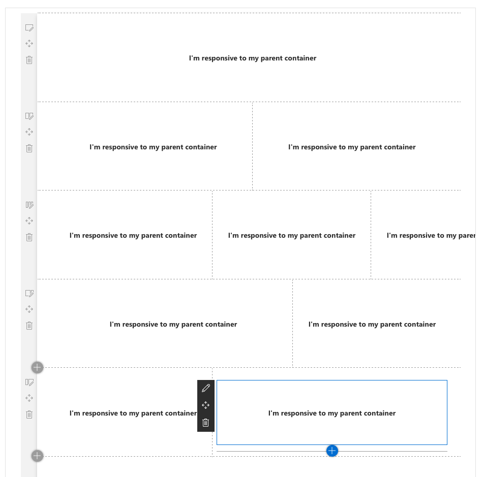
SPFx Workbench result while testing my solution
No colours were applied to the web parts anymore.
What happened? No Office UI Fabric anymore?
The cause was that Microsoft somehow removed the Office UI Fabric support partially from the Online Workbench and Communication sites silently. To be more specific, the Office UI Fabric grid system got replaced by a custom SharePoint grid system based on different class names.
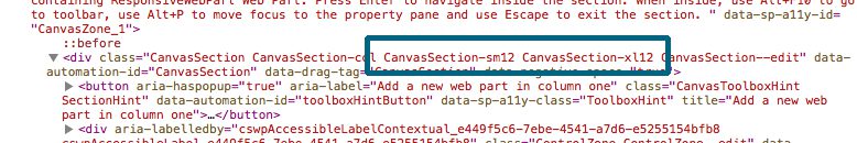
New SharePoint Grid System and renamed class names
For a twelve column layout, you expect a CSS class .ms-xl12. Somehow the class name on the online workbench got replaced by the class name Canvas-xl12. The same applies to other column setups too.
- 8 Columns: .ms-xl8 uses now the CSS class .Canvas-xl8
- 6 Columns: .ms-xl6 uses now the CSS class .Canvas-xl6
- 4 Columns: .ms-xl4 uses now the CSS class .Canvas-xl4
- 3 Columns: .ms-x3 uses now the CSS class .Canvas-xl3
The list is just a short snapshot of all grid classes. In fact, all of them are now prefixed with ‘Canvas’ and not with ‘ms’ anymore. After I identified this significant change in the page setup for the workbench I needed to adopt the code altogether.
The mentioned blog post shows only the pure CSS / CSS Modules side of the solution but not SASS. The change is reason enough to improve the code and make it working again now. To remember for example to make the web part responsive to twelve grid columns I used the following code.
:global {
  // We assume the parent container use 12 columns
  .ms-xl12 {
    // then we switch to a local scope.
    // ⚠️☠️ DO NOT ADD ANY OTHER STYLE IN HERE ☠️⚠️
    :local {
      // and use the web part container class
      .responsiveWebPart {
        // finally color the web part background
        background-color: $red;
        color: white;
      }
    }
  }
}
Address responsive web part with changed class names.
The overall code shown in the mentioned blog post uses copies of the same piece of code for every possible page setup and grid class name. The golden rule in development is, when you use the same source code, again and again, you might create a function for that. SASS even has functions, in this case, the appropriate tool is to use a so-called @mixin.
// mixin definition takes class of parent container
@mixin optimizeWebPart($gridcolumns) {

  // Set the CSS Module scope to global
  :global {

    // inject column setup here e.g. .CanvasSection-xl12
    #{$gridcolumns} {

      // switch the scope again to local for the web part
      // ⚠️☠️ DO NOT ADD ANY OTHER STYLE IN HERE ☠️⚠️
      :local {

        // include content of mixin in here
        @content

      }

    }

  }

}
I named this mixin optimizeWebPart, and this takes the class name of the grid system as a parameter. Inside the mixin, I first switch the context of the current CSS again to global. It allows me to access the grid setup of the page outside of the web part.
The #{$gridcolumns} looks interesting and you might haven’t it seen before. This statement is called ‘interpolation’. The parameter $gridcolumns will pass a string and the value only can be used for CSS properties. So mainly the following code in SASS doesn’t work.
@mixin optimizeWebpart($gridcolumns) {
  $gridcolumns
}
In this case, SPFx reports an error.
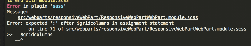
SPFx Error when using variable directly
Not when you use interpolation, which added the value as part of the CSS and not as a value to the resulting code. Through the use of #{$gridcolumns} we make SASS aware that this is part of the CSS and not an actual value of a property. You will find more on this in the SASS documentation. The final part of this mixin is the @content which outputs any content implicitly passed to the mixin. Normally you tend to call a mixin like this:
@include optimizeWebpart(".CanvasSection-xl12")
There is nothing wrong with this for many mixins, but more advanced accept even a more significant amount of code to include other than using the parameter method. The twelve grid column setup call actually can look like this:
// Take the class name for the 12 grid columns
@include optimizeWebpart(".CanvasSection-xl12") {

  // all in side the curly braces is accessible through @content
  .responsiveWebPart {
    background-color: $red;
    color: white;
  }

}
This code calls the mixin and passes the class name of the outer web part, plus embed the content specifically for this web part setup. To call for different configurations look like this.
// Canvas Section CanvasSection-xl12
@include optimizeWebpart(".CanvasSection-xl12") {
  .responsiveWebPart {
    background-color: $red;
    color: white;
  }
}

// Canvas Section CanvasSection-xl6
@include optimizeWebpart(".CanvasSection-xl8") {
  .responsiveWebPart {
    background-color: $green;
  }
}

// Canvas Section CanvasSection-xl6
@include optimizeWebpart(".CanvasSection-xl6") {
  .responsiveWebPart {
    background-color: $teal;
  }
}

// Canvas Section CanvasSection-xl6
@include optimizeWebpart(".CanvasSection-xl4") {
  .responsiveWebPart {
    background-color: $yellow;
    color: black;
  }
}
Through using this kind of mixin the CSS code is easier to read the fact we defined the global/local CSS structure only one it is easier to debug also. Finally, the code of my demo worked again, and I was able to reproduce my sample from a previous blog post.
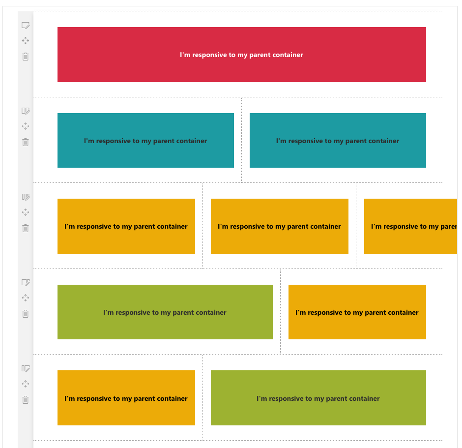
Final result based on use of mixin and changed classnames
Actually, the demo even got a small extra too for the attendees also.
Finally
Nevertheless, for a short time, I was a little bit confused, and there are still many questions unanswered. Shouldn’t we use Office UI Fabric precisely to create a consistent user experience? What happened to Office UI Fabric? Is it dead now for SharePoint development? Is there a new SharePoint Framework coming or do we directly adapt to Fluent Design? Is the Canvas now part of an upcoming new page model?
To be honest currently, only the grid system of Office UI Fabric seems to be removed from the SharePoint Framework Online and Communication sites. The local workbench and this is where it becomes part, still supports Office UI Fabric. Time will tell and meanwhile I create a GitHub Issue on sp-dev-docs. At least I was able to show an optimised way of making web parts responsive.
Very troubling !