As promised in my blog post “What is inside your SharePoint CSS” I like to show how it is possible to add a grid system to SharePoint without using Bootstrap or edit the master page.
Grid systems for web sites were popular long before Ethan Mascotte wrote his famous article about “Responsive Web Design” back in 2010. The first grid system I ever used was the 960.gs. It was released in 2008.
The grid system
Whatever you do on a web site always consider to use a grid system. This will give your content structure and save a lot of headache from a usability perspective. Elements of your app or website look balanced. If you like to dive deeper into grid systems I recommend to check out “all about grid system“.
To sum up, the benefits:
- Clarity/Order – Grids bring order to your layout and easier for visitors to find and navigate through the information.
- Efficiency – Grids allow you to quickly add elements to a layout because many layout decisions are addressed while building the grid structure.
- Economy — Grids make it easier for other designers to work and collaborate on the design as they provide a plan for where to place elements.
- Consistency/Harmony — Grids lead to consistency in the layout of pages across a single site or even several sites creating a structural harmony in the design.
SUSY Grid System
To create your own grid system can be pretty hard because you have to do a lot of calculations to set it up right. A thing that can be really annoying sometimes. Luckily, there is such a thing like SUSY | your layout, our math. “Susy” require and is built on SASS. Though mixings it reduces a lot of complexities and you can define in a couple of minutes the grid layout that you like to create. Not the one a framework like Bootstrap tell you to use.
Define your grid according the content and you will make your user happy.
The basics
To set up a basic grid in “Susy” all you have to use are the following lines of code.
With these settings you define how your grid system looks like. The most important settings are:
- math: fluid – we use a fluid layout and makes sure you can resize the grid properly
- container: 90% – The max width of the grid system is 90% of the full page
- container-position: center – means that our layout is centered
- columns: 10 – our grid system has ten columns
- gutter: 1/5 – out gutter (space in between the grid columns is 20% of the width of a column)
- gutter-position: split – means that half of the gutter belongs to each grid column
Apply Susy to SharePoint
First, let’s take a look at out SharePoint areas we need to apply the grid system. All we need to use for our grid system are the following DIV-elements.
- titleAreaBox
- sideNavBox
- contentBox
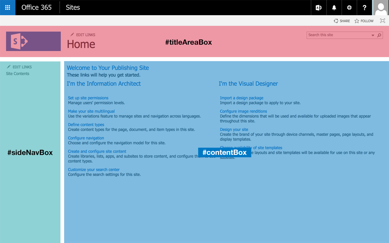
Section in SharePoint where the grid will be applied to.
The rest of the surrounding elements we can ignore. The grid system won’t be applied to those.
Before we are able to apply the grid to those content areas we need to tell the surrounding container ‘#s4-titlerow’ and the ‘#contentRow’ to be the main columns of our grid. This can be done by simply using the mixin ‘container’.
#s4-titlerow,
#contentRow{
    @include container();
}
Now the grid is set in place. The next thing that needs to be done is to assign a proper column span to our design.
Basis Grid Container
The first thing I define is that the header column should span across the whole area.
#titleAreaBox{
    @include full;
}
“Full” is also a mixing provided by this tool. Now the logo as well as the search box perfectly aligns to the grid.
The next thing we define is that the navigation show span across two columns, while the rest should be filled up by the content.
#sideNavBox{
    @include span(2 of 10);
}
#contentBox{
    min-width: 0px;
    @include span(8 of 10);
}
Two things are important for out grid layout. To resize the ‘contentBox’ properly, we need to specify the min-width to 0px. This needs to be set because the corev15.css defines the ‘min-width’ to be 703px.
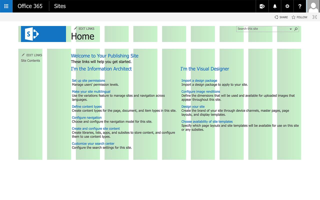
The last thing needs to be done is to run of the debugging option. This can be found in the base susy configuration under “debug”.
...
  debug: (
    image: hide,
    color: rgba(#66f, .25),
    output: background, // background | overlay
    toggle: top right,
    ),
...
The only thing that needs to be done there is to change the value of images from “show” to “hide”. Now we have a perfect aligned grid without editing the master page or adding some classes to the master page.
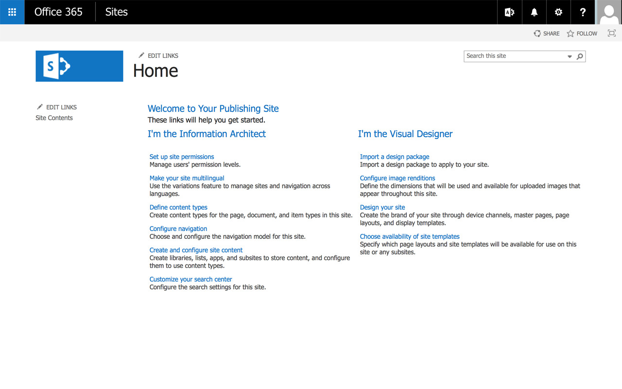
Final Grid applied to SharePoint
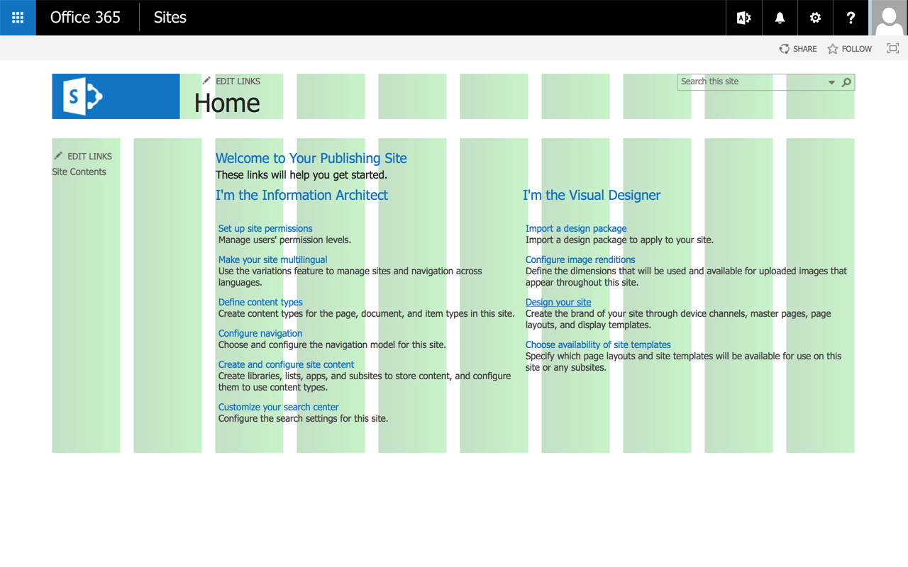
Final Grid Overlay
The CSS – compiled by SASS
Sass and Susy did a really great job on creating a custom grid for our SharePoint but how does the compiled CSS look like?
#s4-titlerow,
#contentRow {
    max-width: 90%;
    margin-left: auto;
    margin-right: auto;
}
/* clearfix for both rows */
#s4-titlerow:after,
#contentRow:after {
    content: " ";
    display: block;
    clear: both;
}

#titleAreaBox {
    clear: both;
    width: 98.3333333333%;
    float: left;
    margin-left: 0.8333333333%;
    margin-right: 0.8333333333%;
}

#sideNavBox {
    width: 18.3333333333%;
    float: left;
    margin-left: 0.8333333333%;
    margin-right: 0.8333333333%;
}

#contentBox {
    min-width: 0px;
    width: 78.3333333333%;
    float: left;
    margin-left: 0.8333333333%;
    margin-right: 0.8333333333%;
}
Again a perfect calculated grid. Even the clear fix for the floating elements is set correctly.
Conclusion
This basic example shows how to set up the basics for a responsive web design. The grid system.
You can use this tool in your media queries too. All you need to do there is simply specify a new column span or specify to span the full width of the container.
Susy gives the designer and developer a great flexibility to transform the content in any grid system.
Bootstrap on the other hand, rely on a 12 column grid system. It is not a good and not a bad grid system, it matches just somehow any content. The downside of this limitation is that any website looks the same.
Another side effect is that you have to mess up your HTML structure and in the case of SharePoint your master pages with somehow obvious style sheet classes. It also includes bad practices way beyond that.
If you like to dig deeper into Susy check out the following links:
- Mobile-First Magic Grids
- Build Web Layouts Easily with Susy
- Fix 90% of Your Problems With Susy by Getting This One Concept Right
If you like to play around with this sample feel free to do so. I published this on GitHub. As mentioned in the earlier post I use mostly Yeoman for my branding SharePoint and integrate it into SharePoint and in Office 365.
Hi, do you have a blog post about setting up Sharepoint 2013 (on premise) on a local environment? Or any references to such? I’d love to try some of your SUSY grid development but currently the only way I’m able to do any CSS changes to my theme are by downloading the CSS, updating it, re-publishing it, and viewing it on the LIVE site. I’d like to do this locally if at all possible, but haven’t a clue how to get it set up currently.
I use a VM to access a Win 7 machine where I then can access the Sharepoint 2013 install/Sharepoint Designer, but I work on Mac OS X for everything else.
Thanks in advance!
Sure, I use yeoman gulp-webapp and simply embed the localhost css into SharePoint. Check out How to use CSS and JavaScript files from Yeoman directly in SharePoint
I guess this is the right thing you are looking for. I use it on Mac OS X too.
/Stefan